
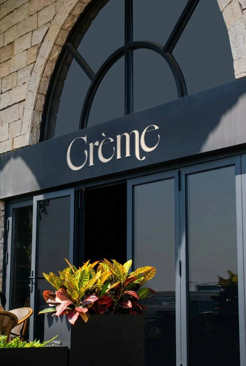
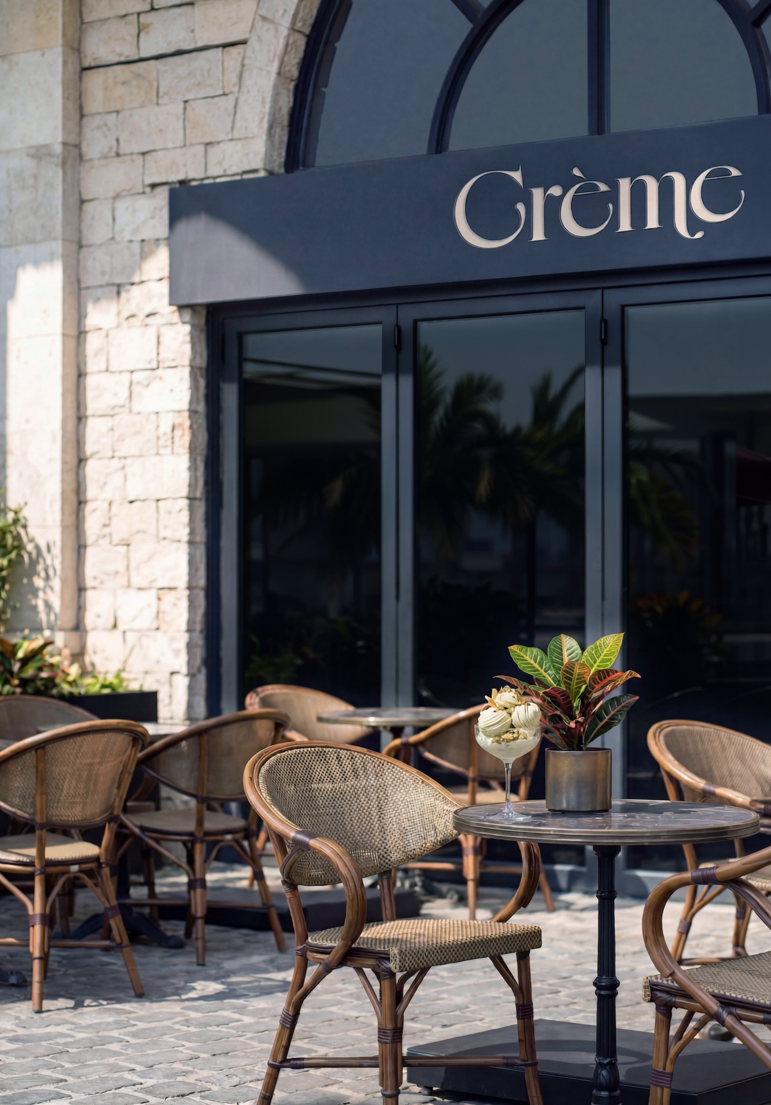
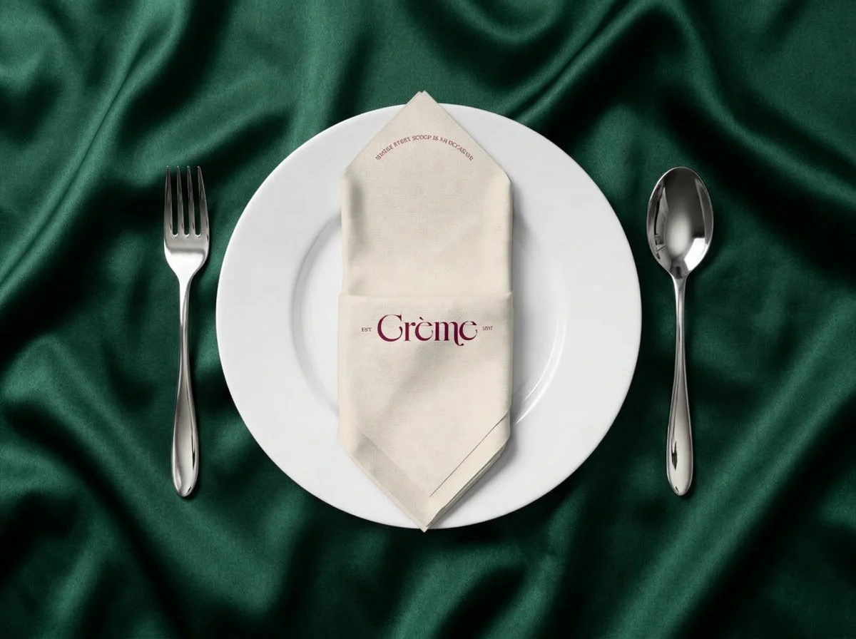
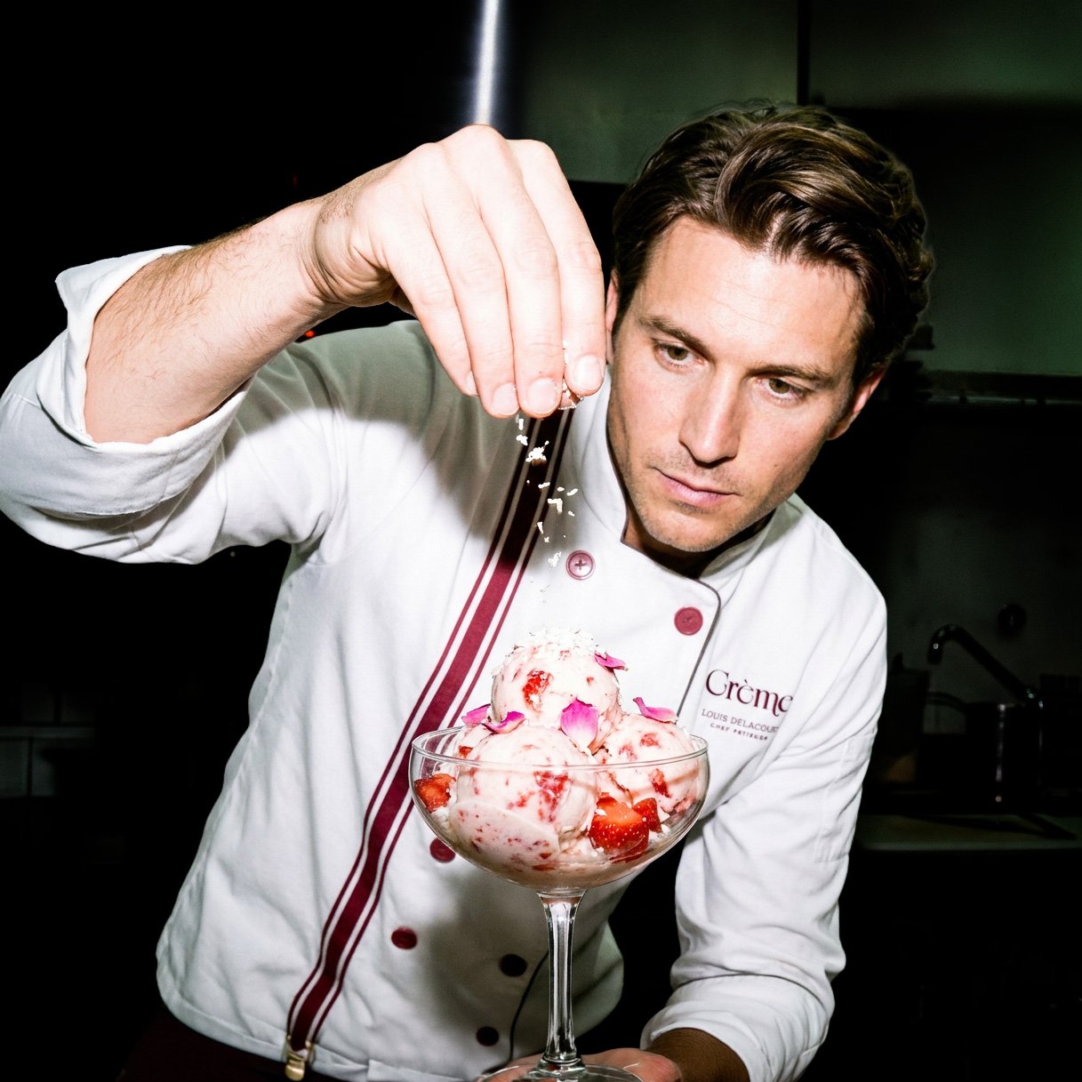
Crème
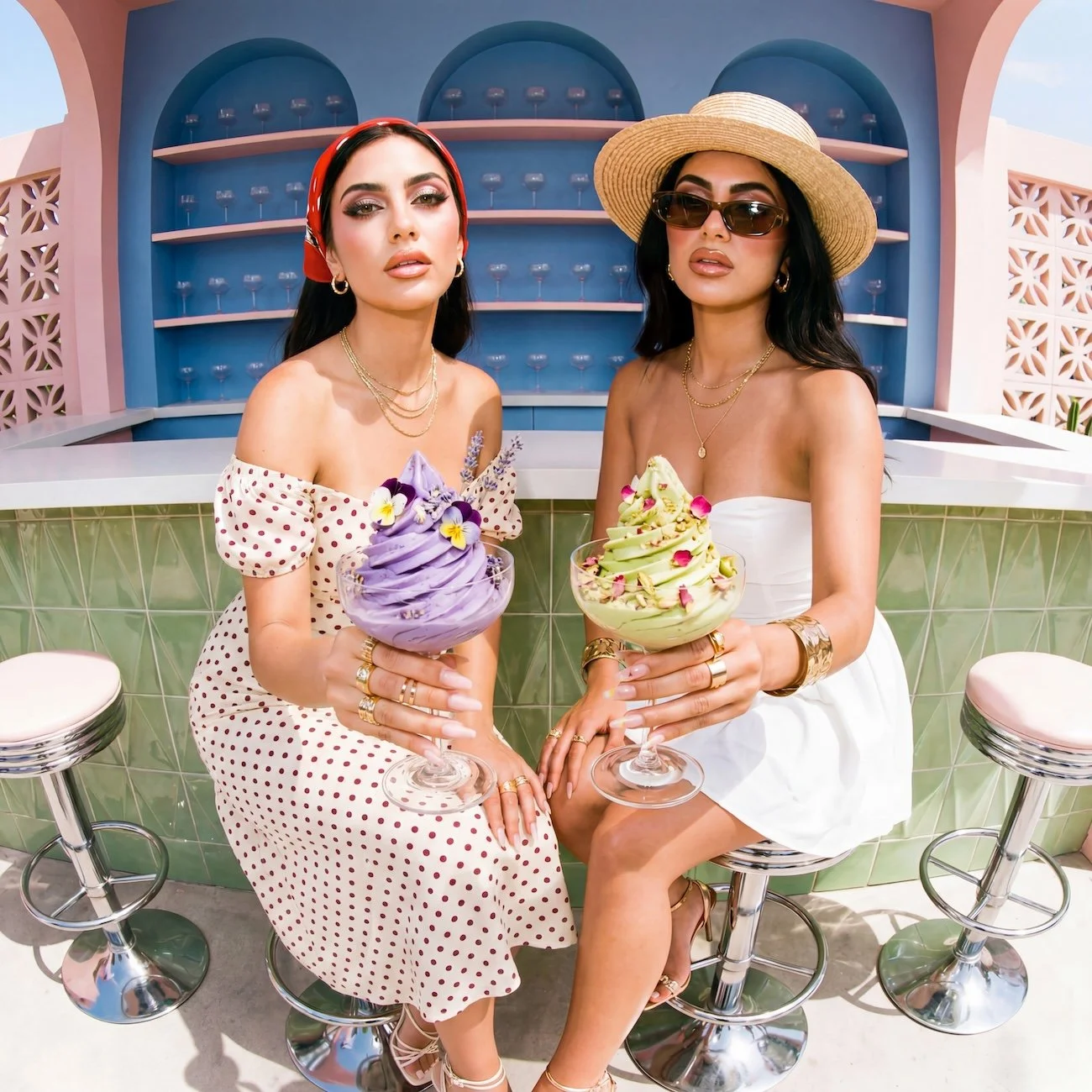
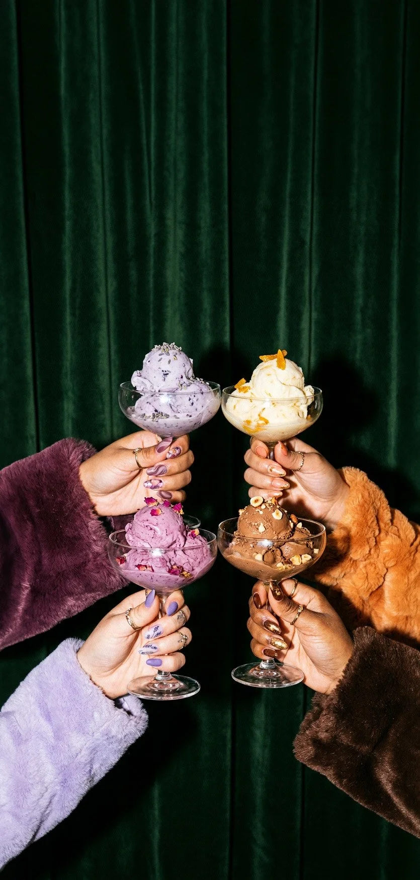
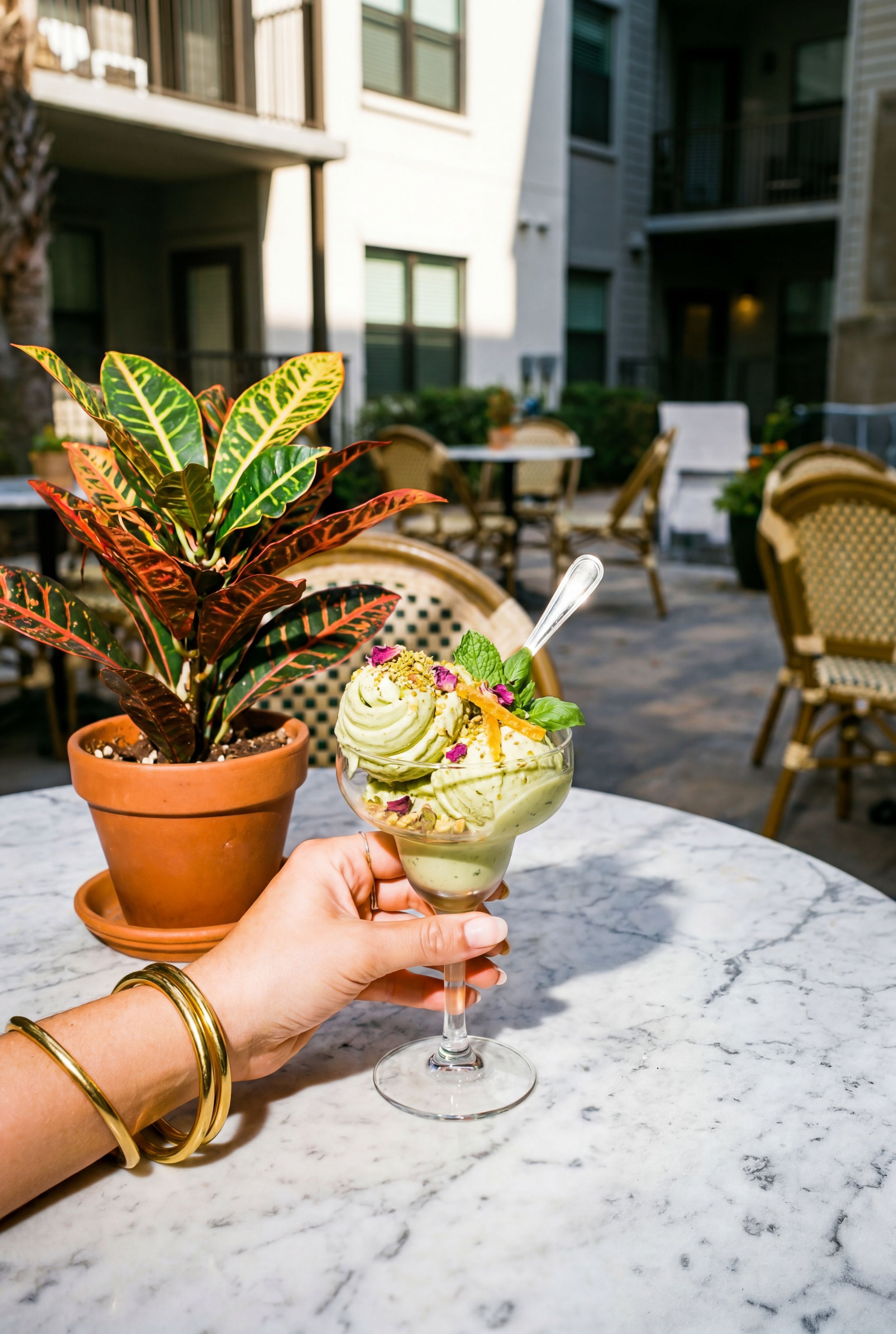
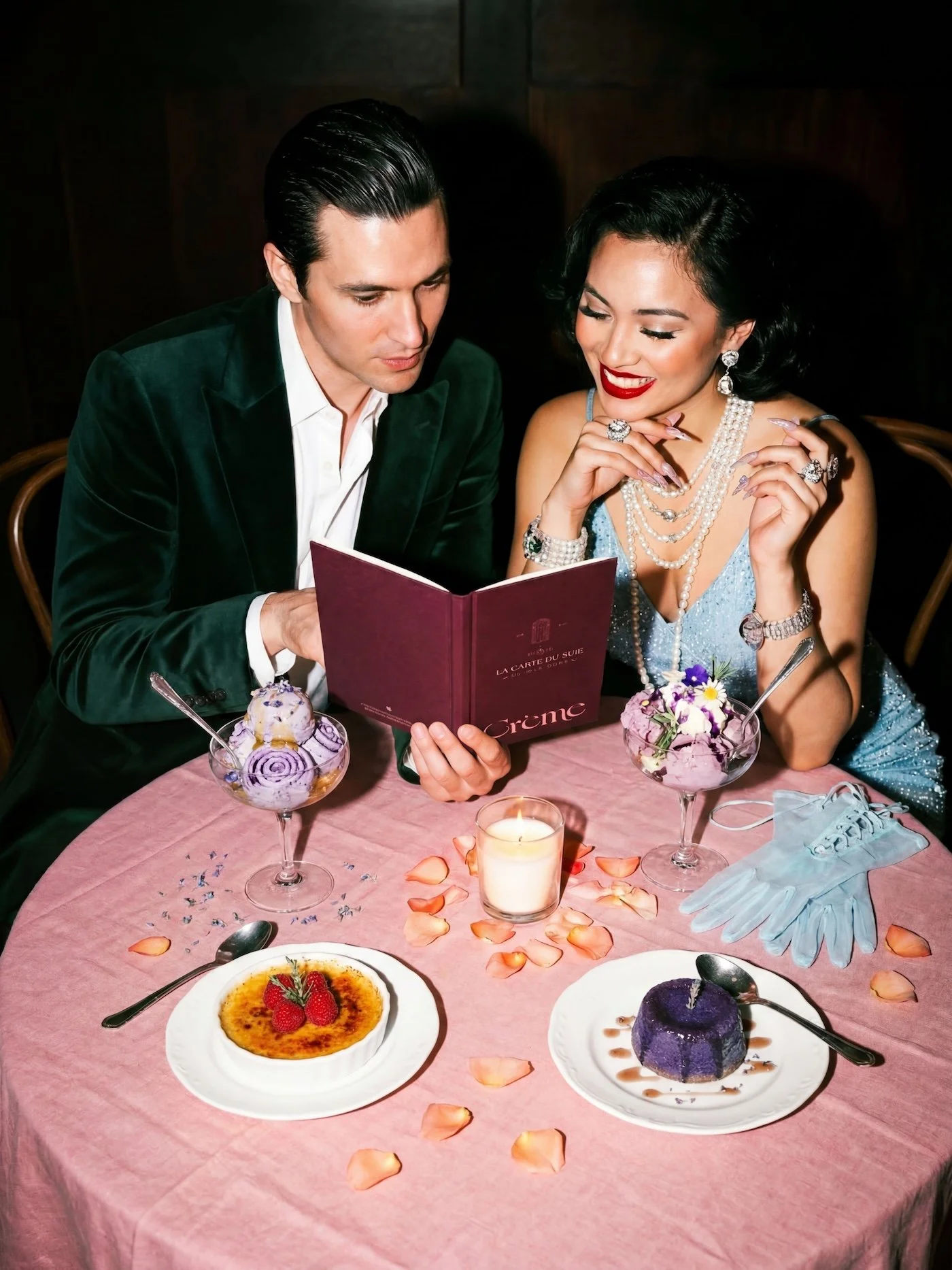
Crème was born from the idea that ice cream shouldn't just be a snack — it should be a moment. Créme is not a dessert shop. It is a glacerie and dessert lounge that feels like Paris filtered through a dream. Velvet seats, warm candlelight, ice creams so carefully made they taste like the places they came from. The brand was created for the couple lingering over dessert long after midnight, and for the group of friends insisting, “You’ve gotta try it.” Centered around artisanal, botanical ice creams inspired by ingredients and flavors from around the world, Crème blends indulgence, exclusivity, and romance into an experience that feels both elevated and deeply sensory.
Brand Identity & Visual System
Social Media Design
Print & Collateral Design
Copywriting
Art Direction
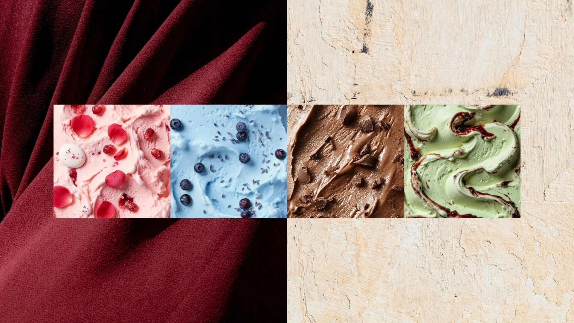
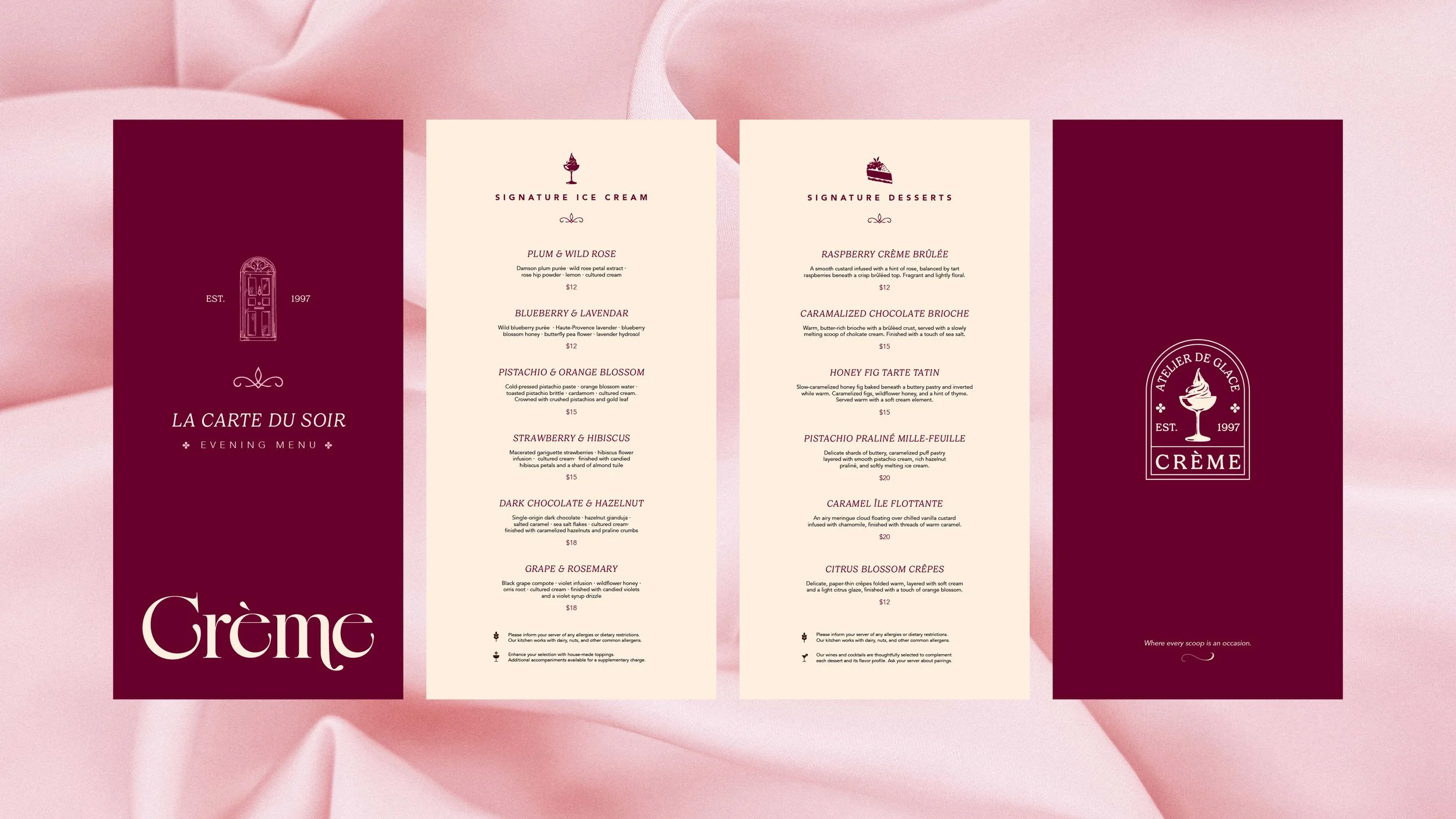
Color Palette
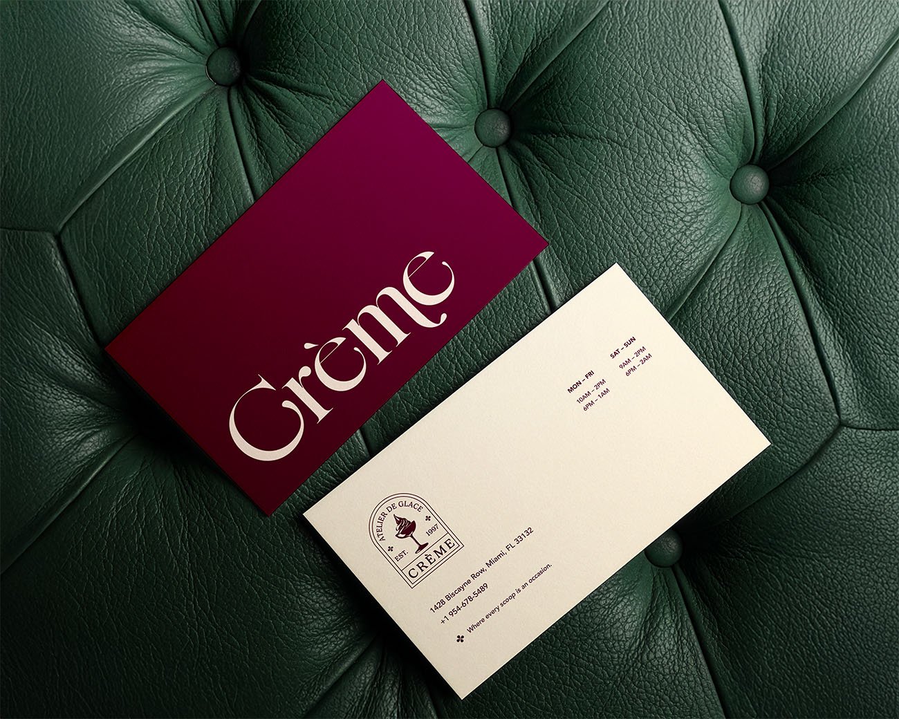
Crème’s iconic color palette draws inspiration from Parisian textures—rich velvets and the timeworn stone of European architecture. Its secondary palette reflects classic, beloved ice cream flavors, adding a sense of familiarity and indulgence to the brand.
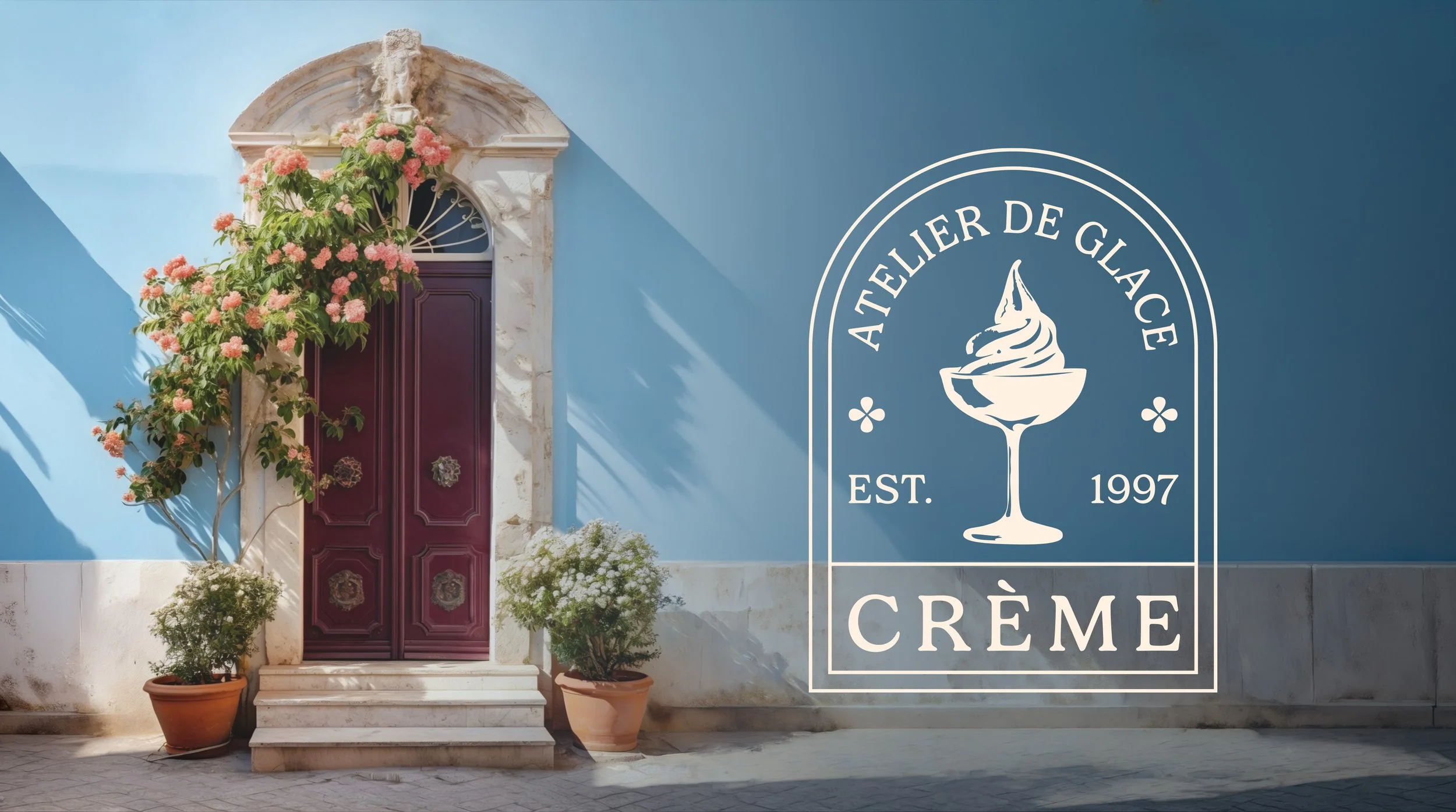
The Embelem
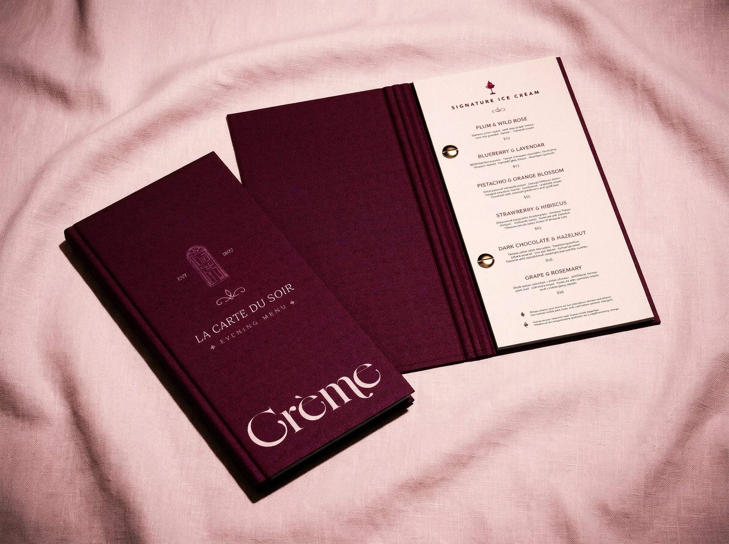
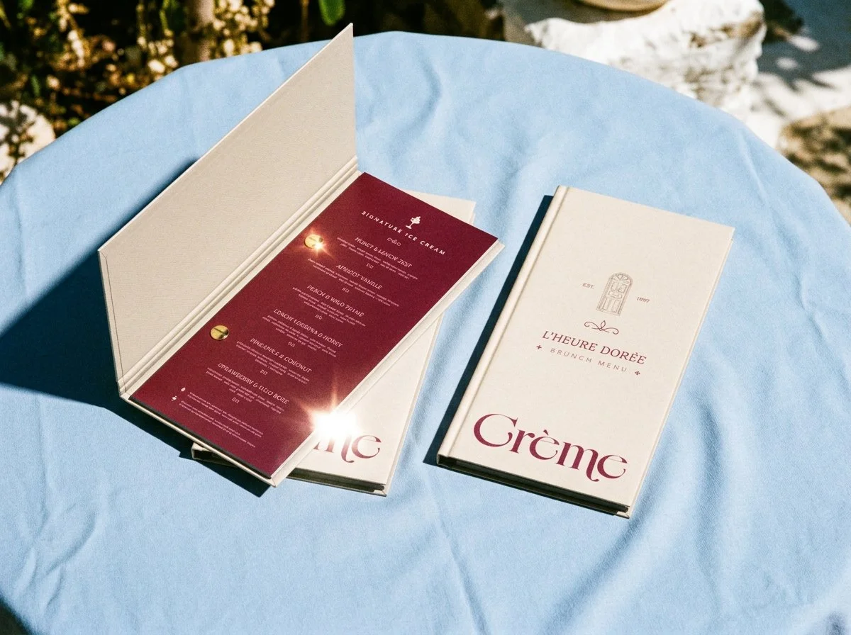
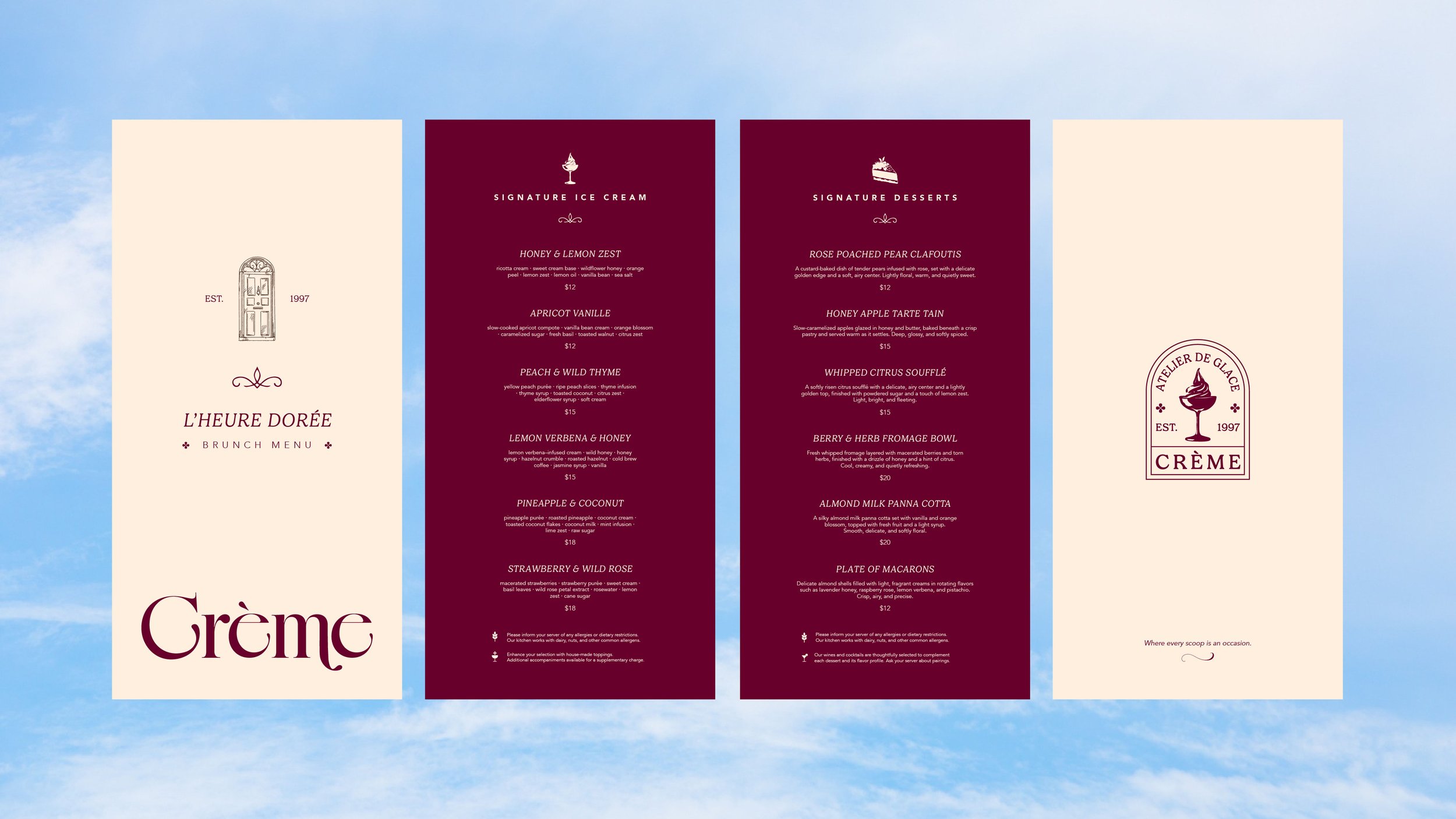
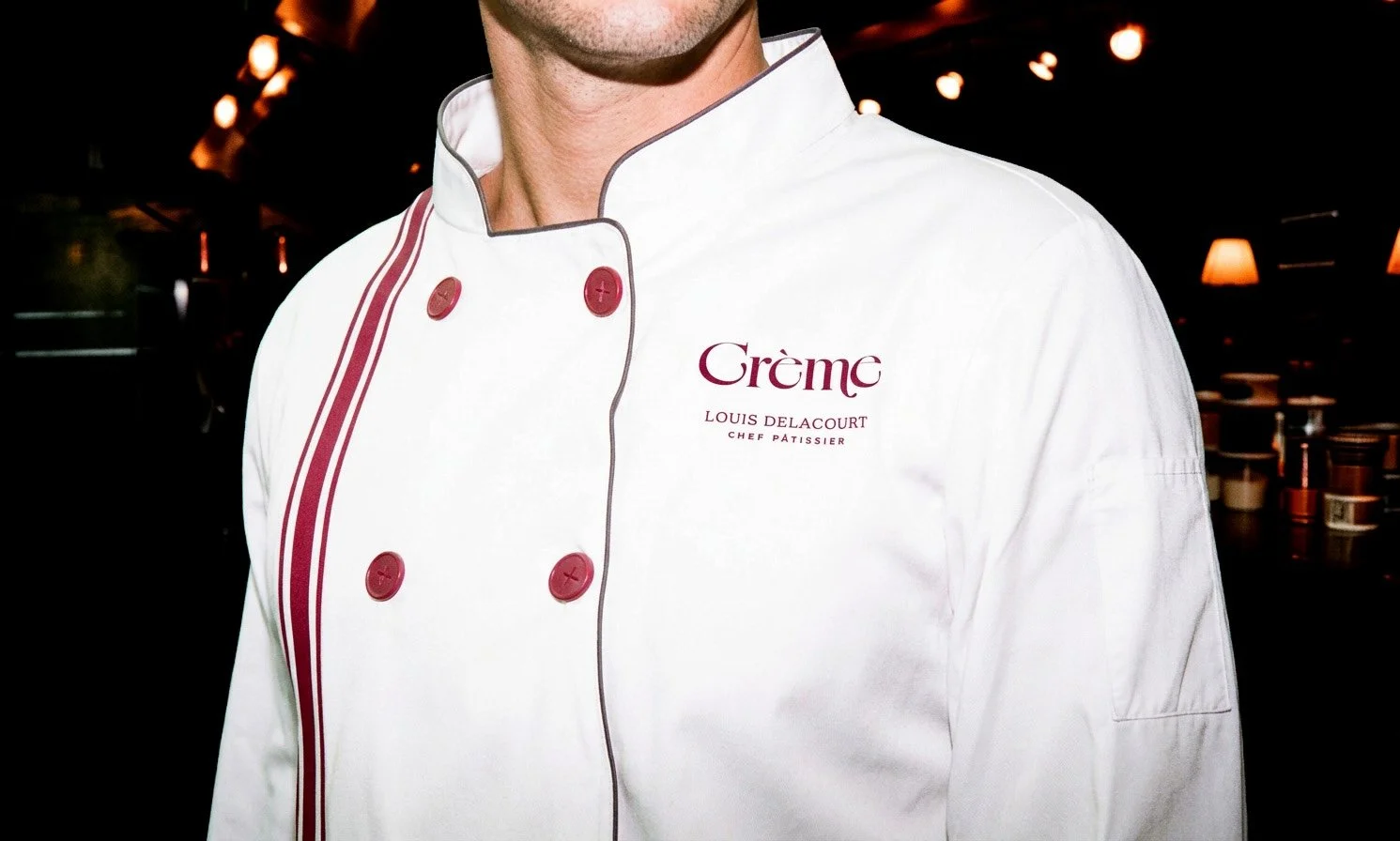
To highlight Crème’s sense of history, I designed an emblem inspired by the arched doorways seen throughout France and Europe. The shape reflects the elegance of these architectural details, giving the brand a timeless, place-driven feel. I incorporated subtle floral glyphs to nod to the brand’s botanical influences, adding a softer touch. The line above “Crème” follows the natural curve of door trim, reinforcing that architectural reference. The ice cream illustration within the badge is treated like a simplified vintage stamp, adding a sense of charm to the brand. It also connects the brand even further because at Crème, ice cream is served in elegant coupe glasses.


Typography
Gelica and Avenir work together to balance softness with structure. Gelica’s rounded forms, bracketed serifs, and gentle contrast bring warmth, elegance, and an artisanal feel, while Avenir’s clean geometry and open, balanced proportions introduce clarity and modern precision. Together, they create a typographic system that feels both indulgent and refined. It captures the elevated yet approachable experience of a upscale dessert lounge.

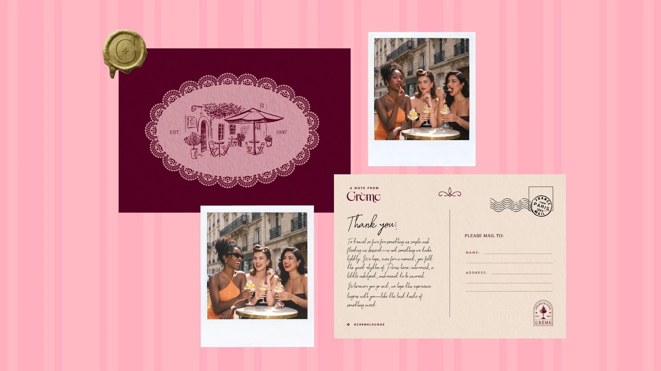
Postcard
The postcard was designed as a keepsake for guests visiting the Paris location. It is a small, tangible way to remember the experience and it extends the moment beyond the visit, allowing guests to take a piece of Crème with them. While guests are eating at the lounge, the staff captures the moment with a polaroid camera which allows for content for social media and advertising purposes.
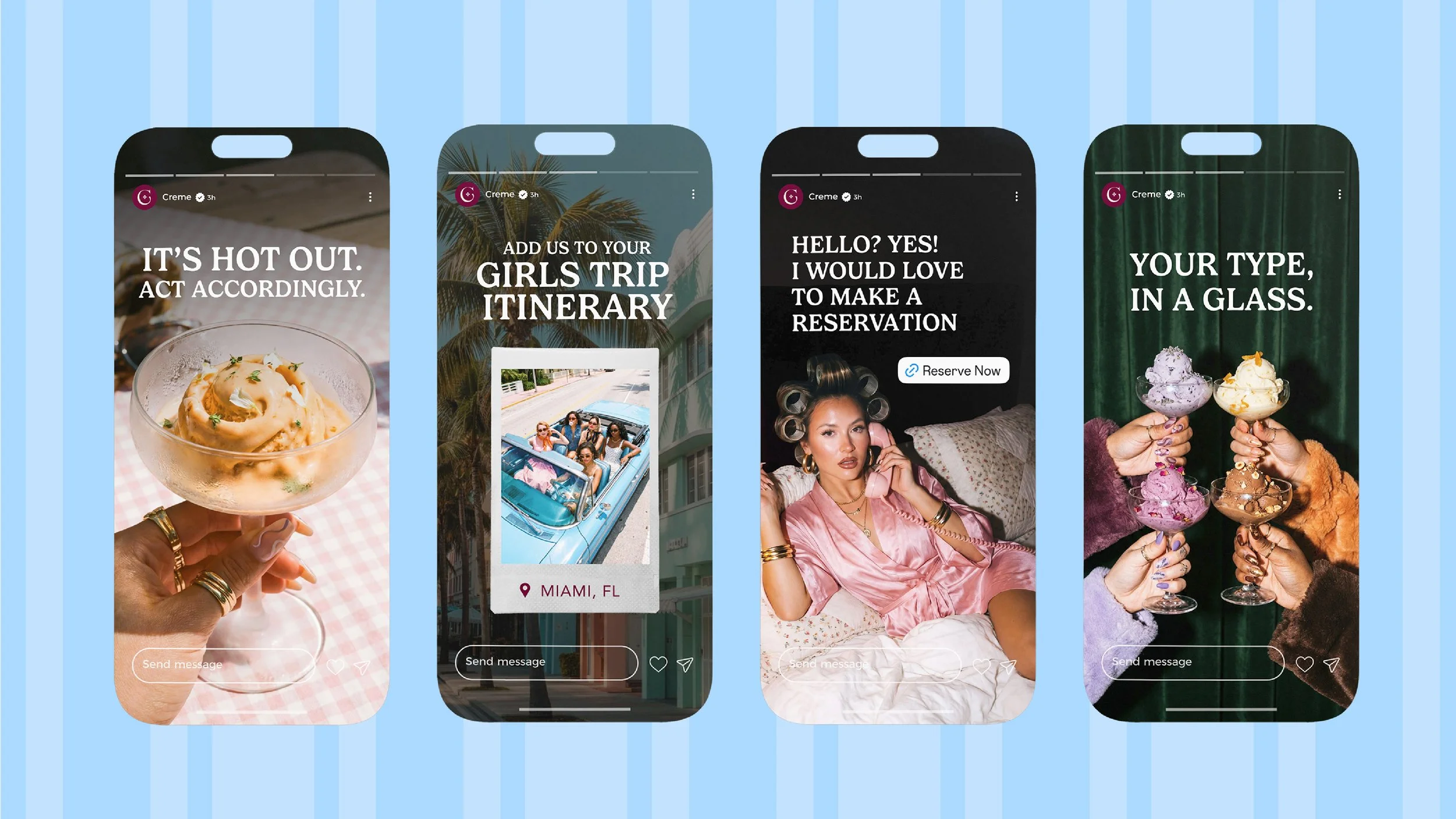
Brand Tone and Voice
Crème speaks in a tone that avoids traditional luxury language in favor of dry, conversational phrasing that feels modern and culturally aware. Rather than over-explaining, the brand relies on short, confident statements that mirror how people naturally speak—creating a tone that feels both intimate and editorial. There is a subtle sense of humor throughout, often expressed through understatement and irony, allowing the brand to feel approachable without losing its elevated positioning. The brand uses hints of flirtatious humor to graviate the target audience of mainly woman ages 25-40.