
Coila
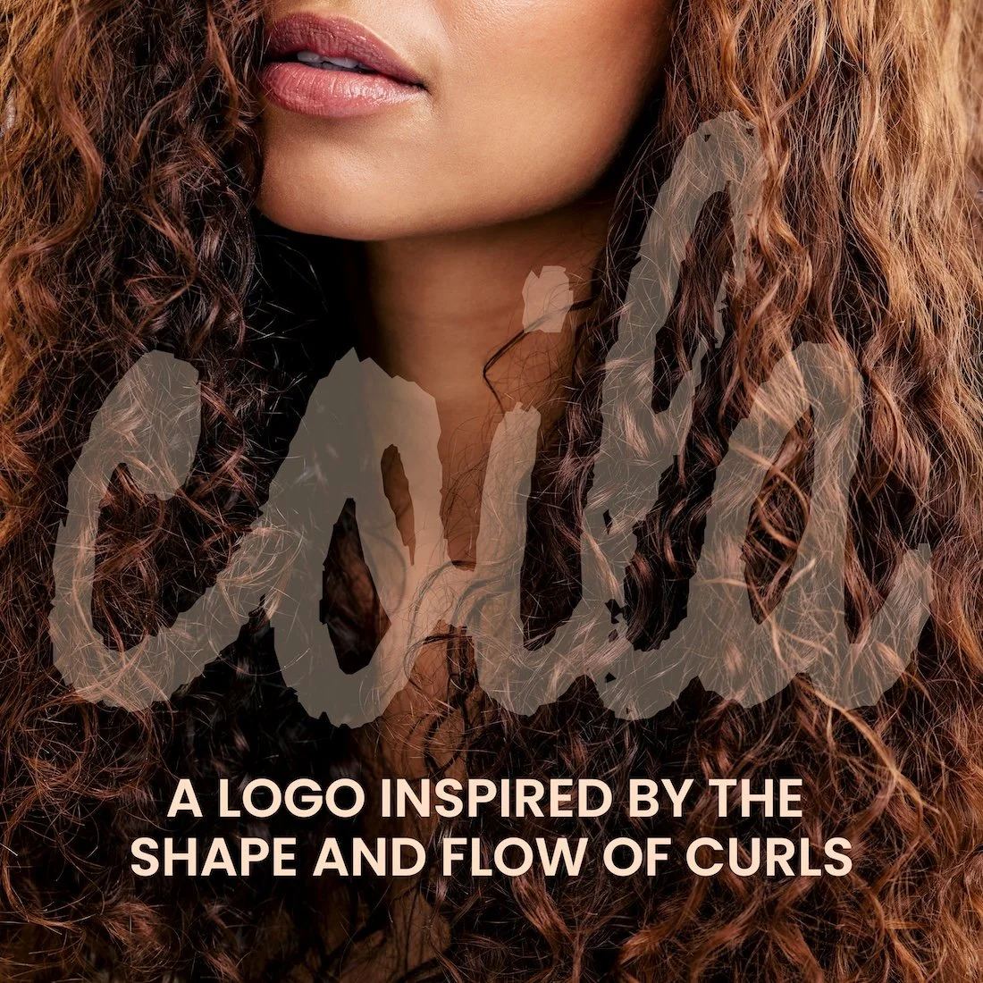
Coila was born from the truth that textured hair has never needed fixing — it has needed understanding. Not a brand chasing trends or promising transformations that exist only in heavily filtered campaigns, Coila operates with a no-BS mindset because the curly hair world has enough noise. No inflated claims, no pretending frizz is the enemy, no products that ask you to shrink yourself to fit them. Every formula was built around the idea that the product should find you — not the other way around.
Coila draws its soul from nature as a design philosophy — the imperfect, perfectly beautiful curves of ocean waves, the spiral of a fern unfurling, the wild unbothered bloom of a flower. These are the shapes coila sees in textured hair. Organic, alive, and breathtaking in their irregularity. Frizz included. Shrinkage included. Every coil, every wave, every curl pattern — exactly as it is. Coila is for the woman who is ready to stop fighting her hair and start learning it.
Brand Identity & Visual System
Packaging Design
Marketing Campaign
Art Direction
Copywriting

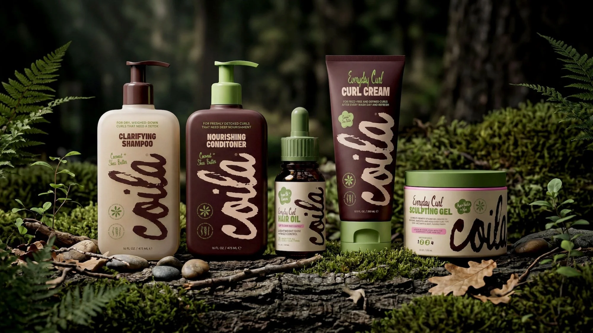
The Everyday Curl Line
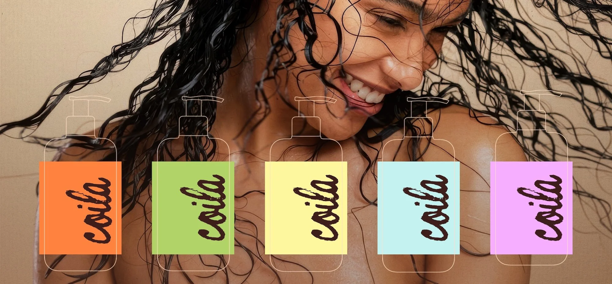
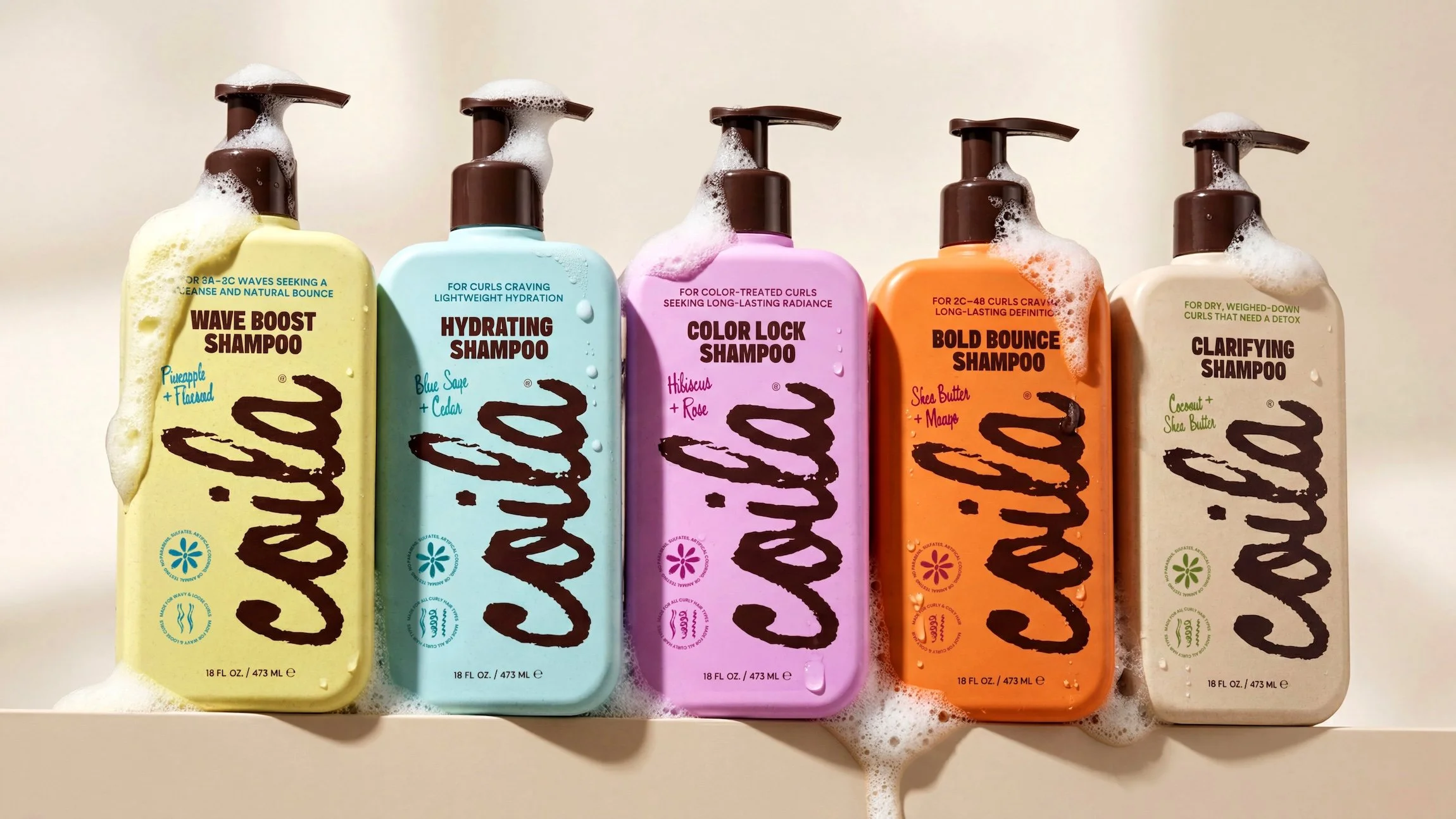
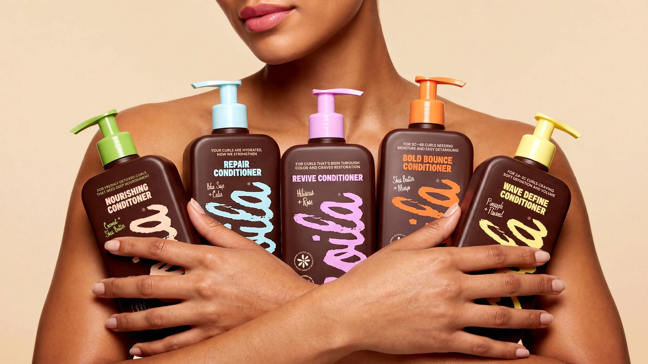
The Everyday Curl line is designed as an everyday system that supports hair in its most natural state. Rooted in simplicity and consistency, it focuses on gentle cleansing and balanced moisture without overcomplicating the routine. Using Coila’s signature beige and brown palette, the collection reflects warmth, melanin, and an earthy minimalism that feels both grounded and intentional. It exists as the starting point of the brand: reliable, versatile, and made to work across textures while setting the tone for everything that follows.
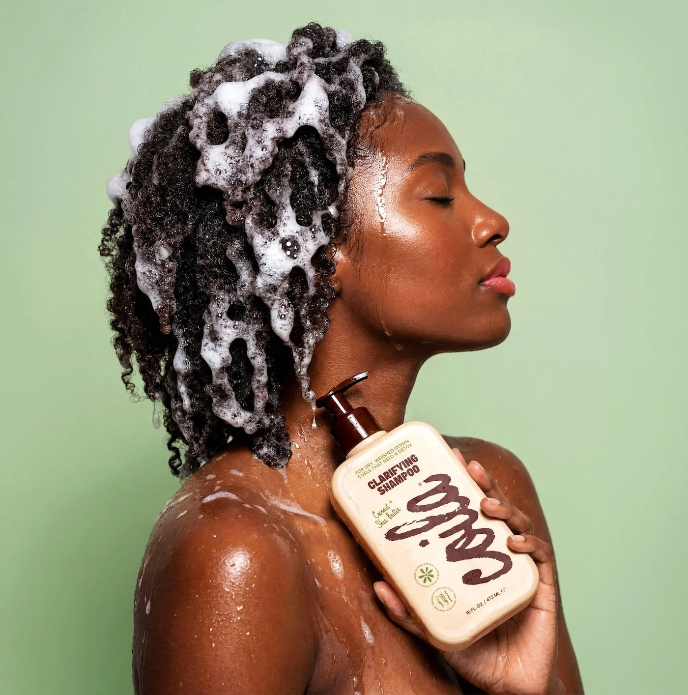
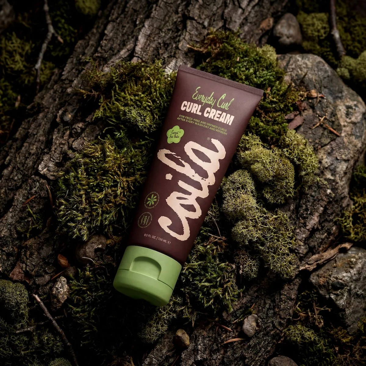
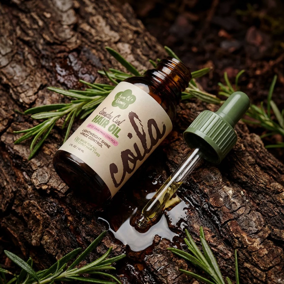
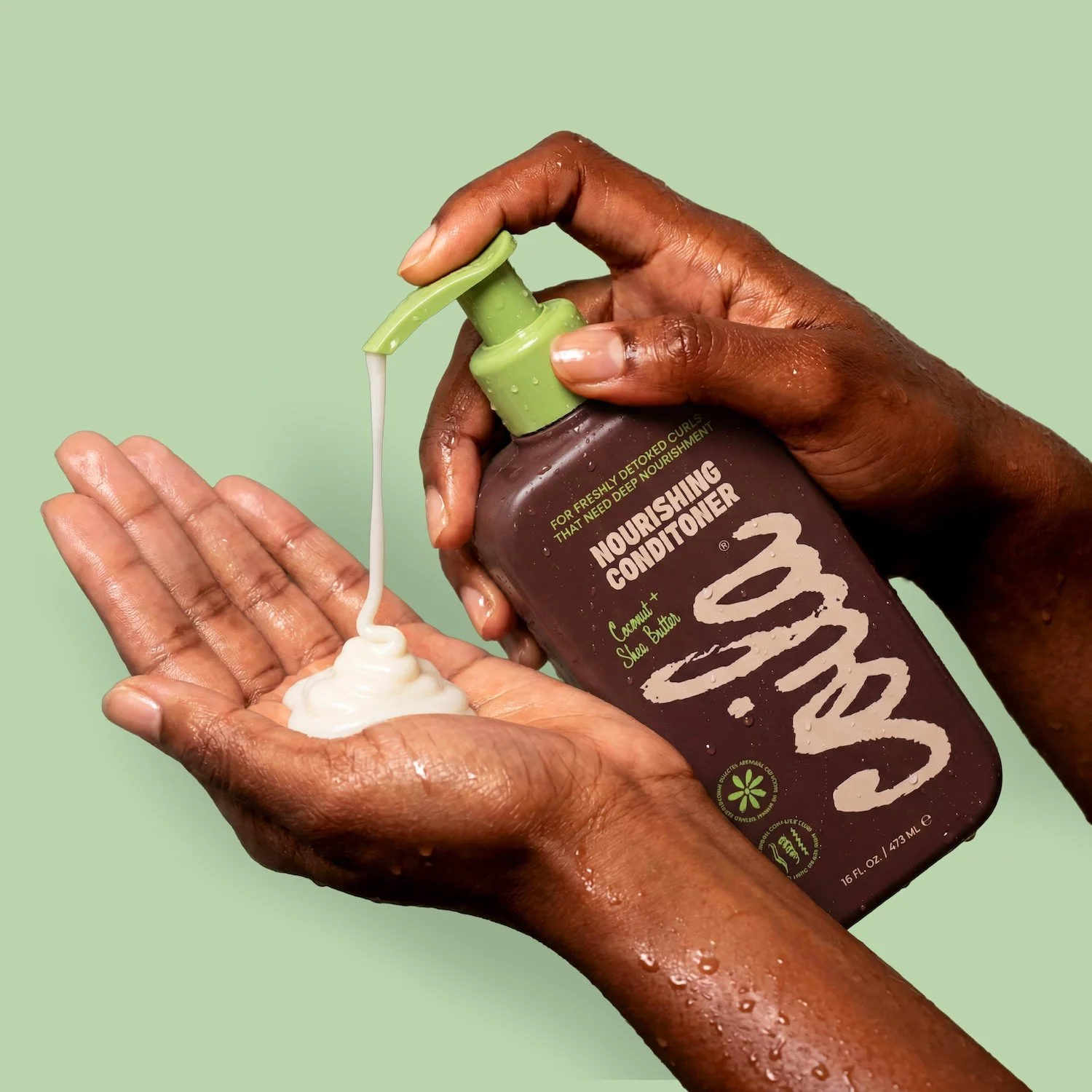
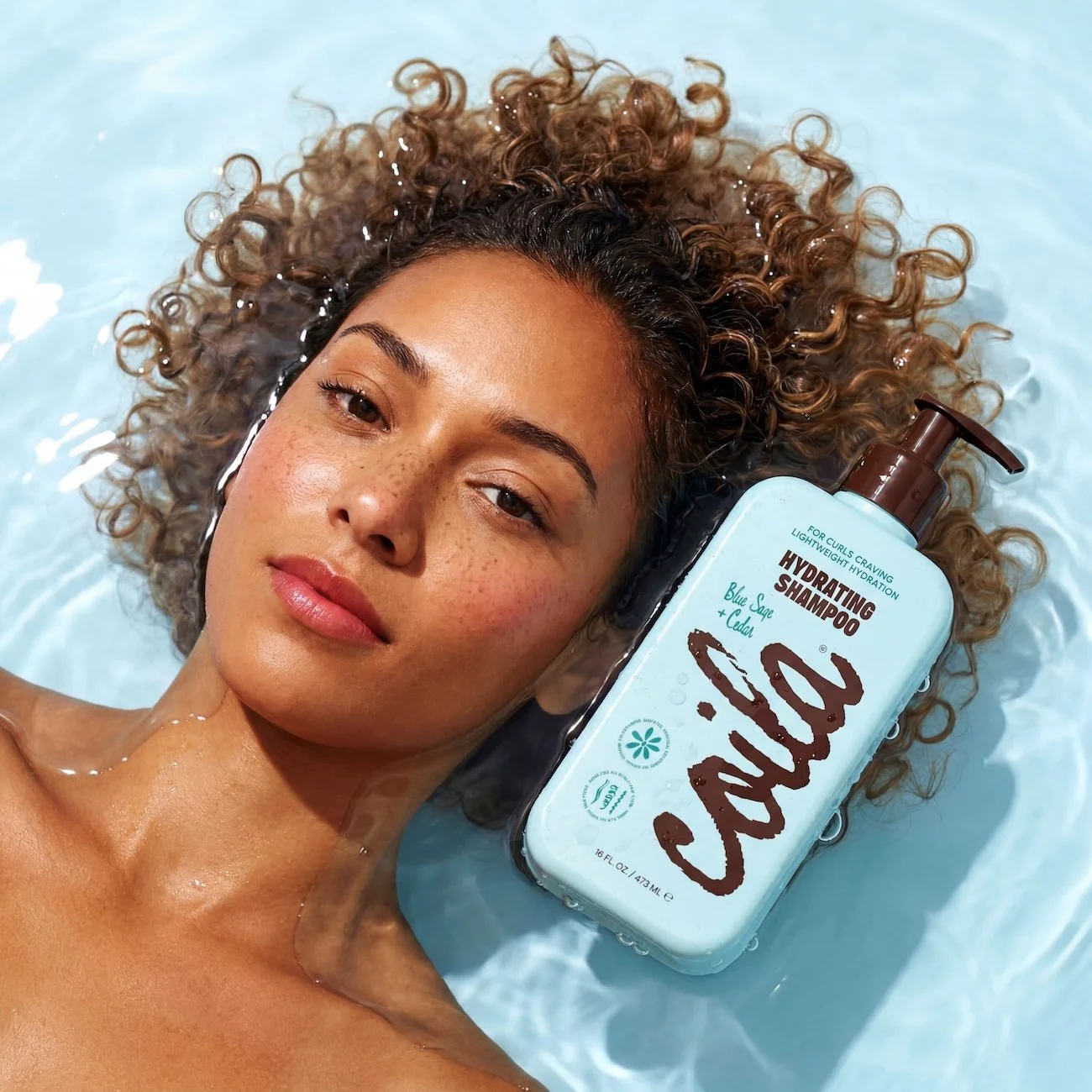

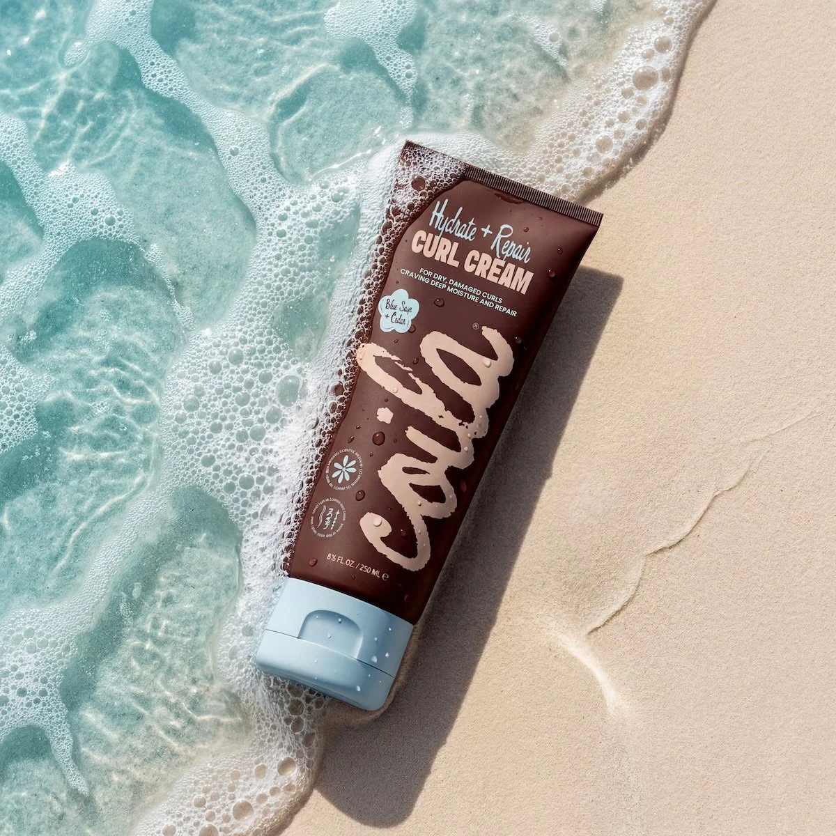
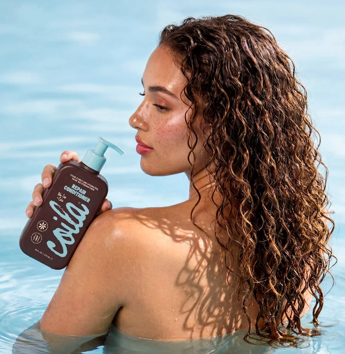
The Hydrate + Repair Line
The Hydrate + Repair line is designed for hair that needs more than daily maintenance—targeting dryness, damage, and loss of moisture at the source. This system focuses on restoring hydration while reinforcing the hair’s structure, helping strands feel softer, stronger, and more resilient over time. It builds on Coila’s foundation by offering a deeper level of care, creating a balance between moisture and repair without weighing the hair down. The purpose of this collection is to bring hair back to a healthier baseline, making it an essential step for anyone experiencing dryness, breakage, or stress from styling and environmental exposure.
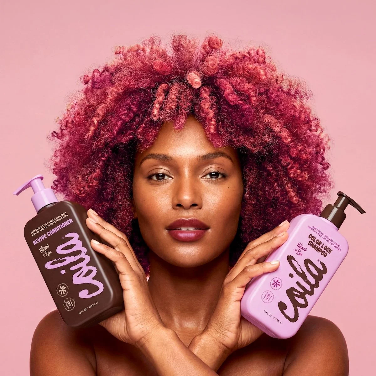
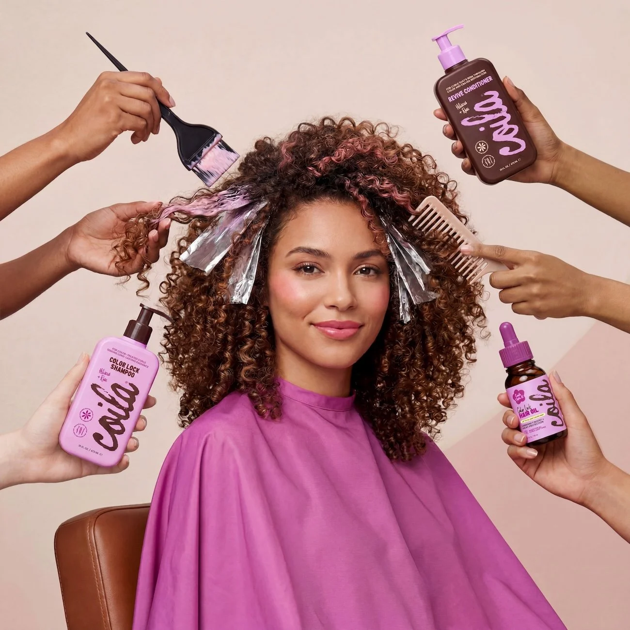
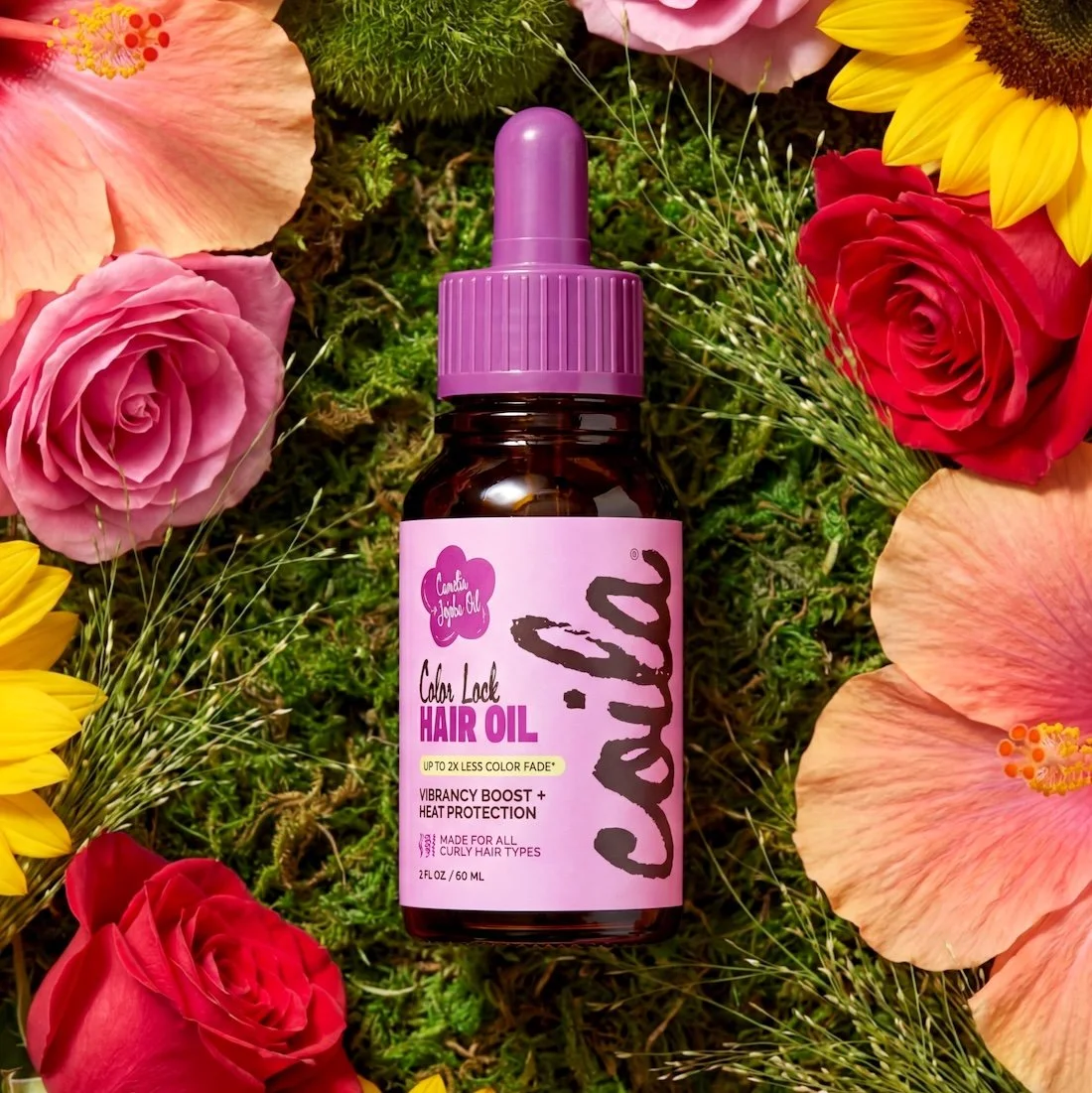
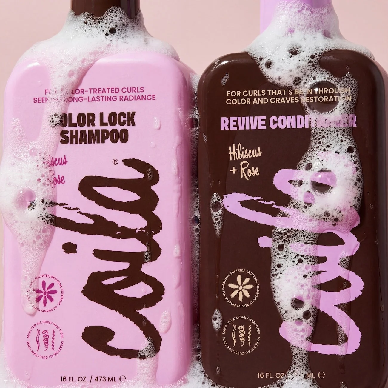
The Color Lock + Revive Line
The Color Lock + Revive line is designed for curls that have been colored, lifted, or chemically treated and need both protection and recovery. This system focuses on preserving vibrancy while restoring moisture and strength lost from heat and bleach processes. By helping seal in color and reinforce the hair’s integrity, it keeps curls looking radiant without sacrificing softness or definition. The purpose of this collection is to extend the life of color-treated hair while bringing it back to a healthier, more resilient state.
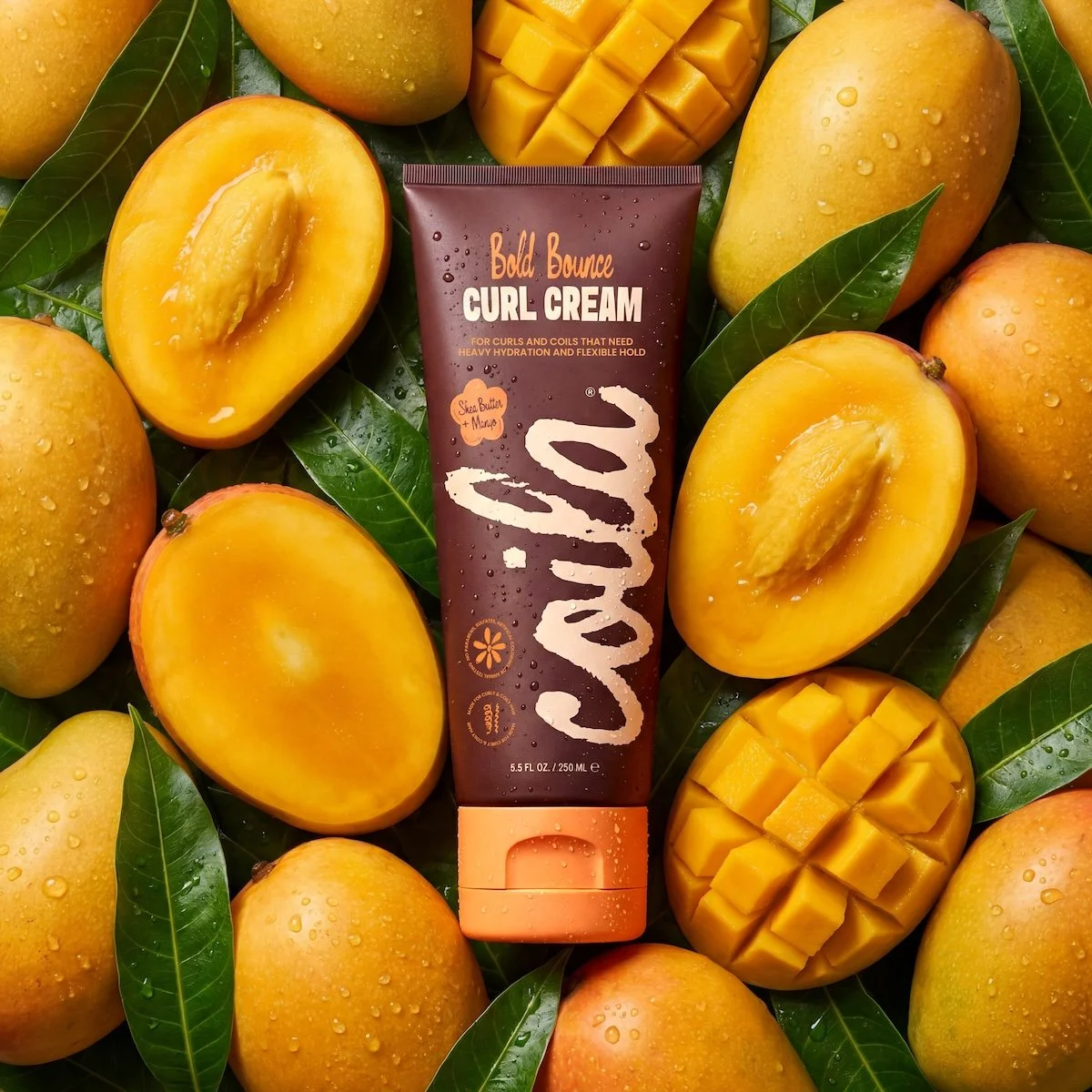
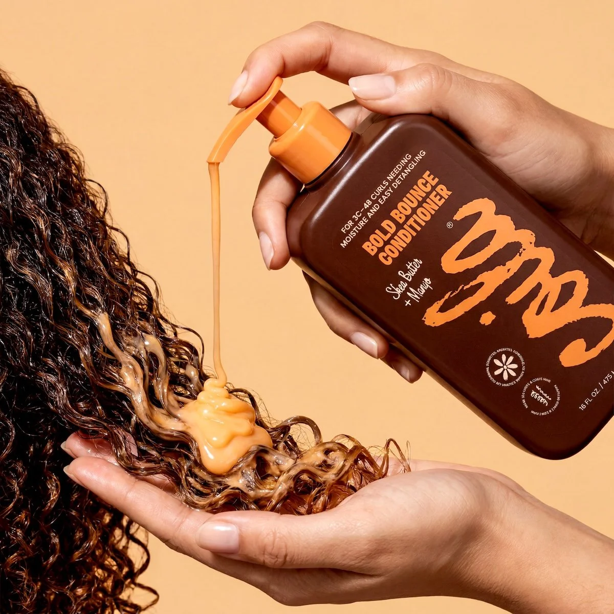
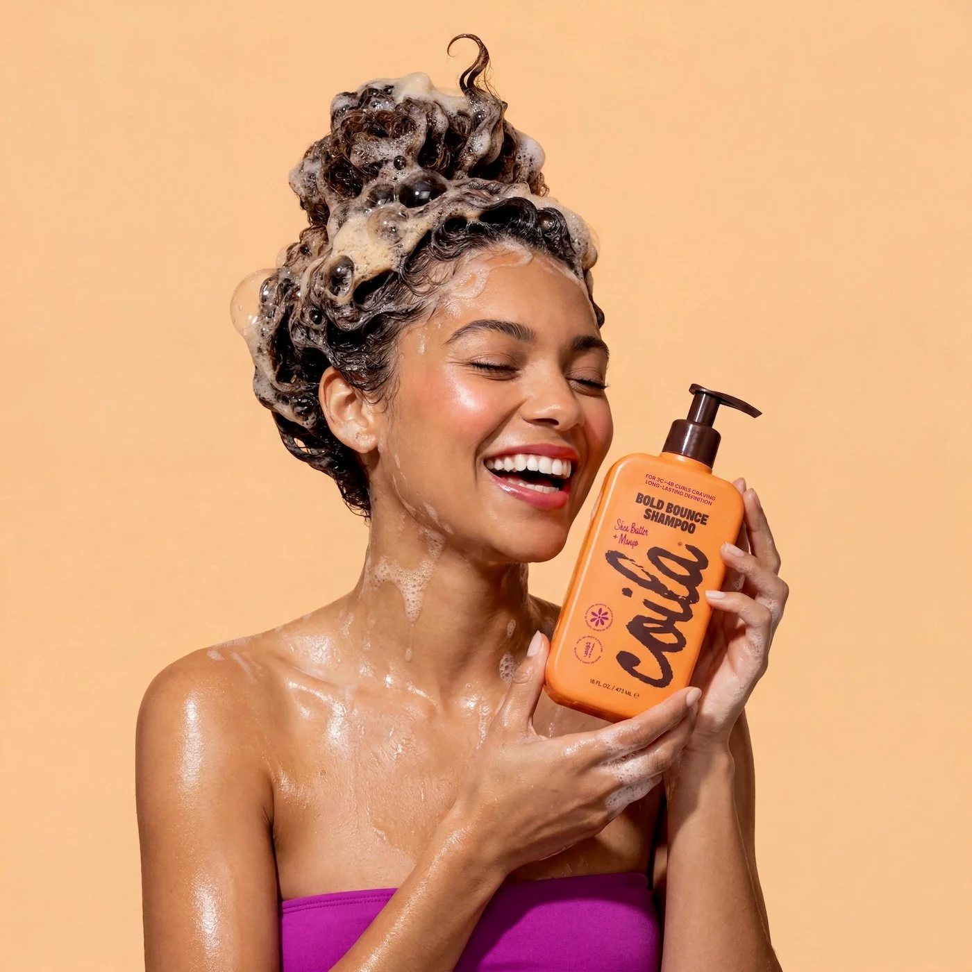
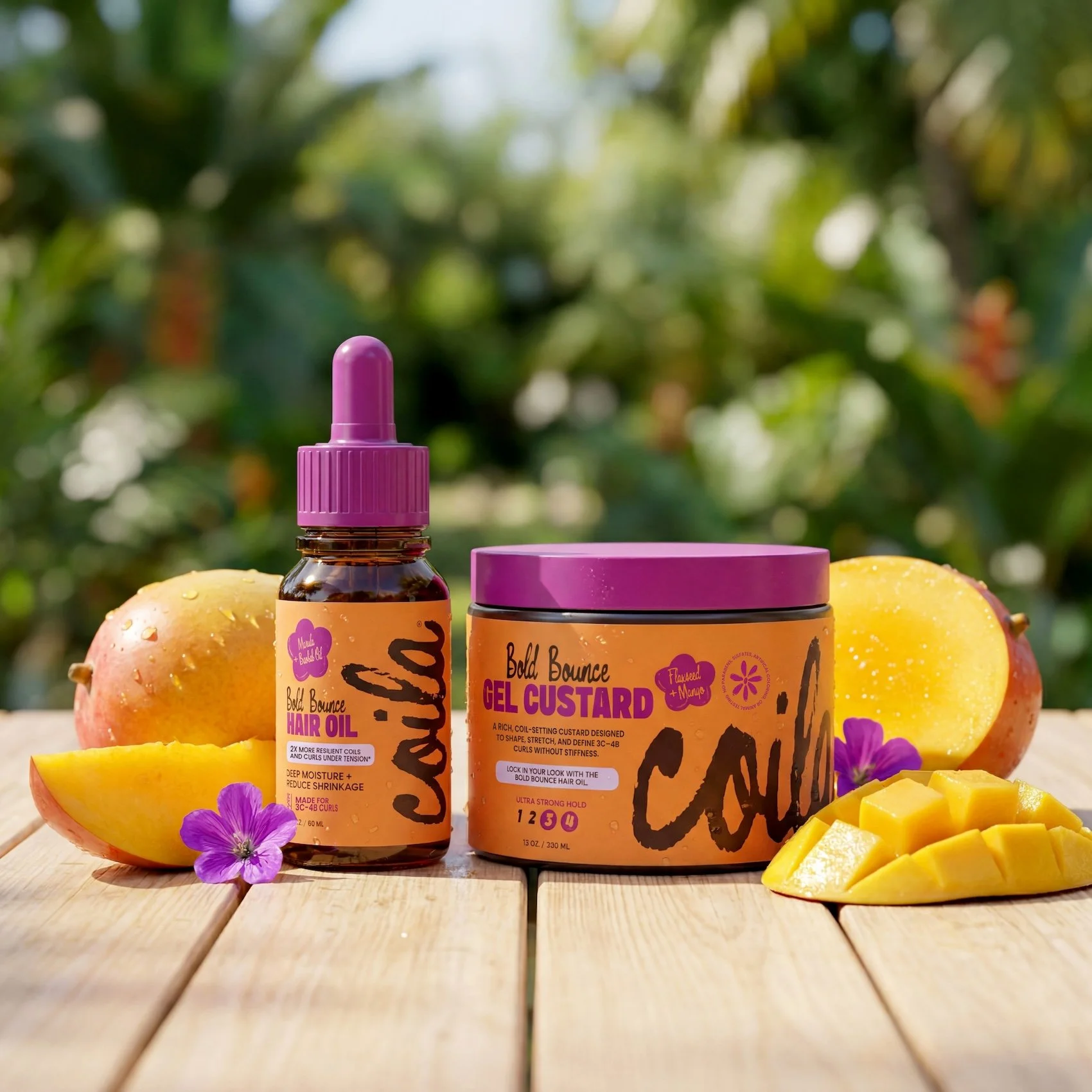
The Bold Bounce Line
The Bold Bounce Line is designed for 3C–4B curls that thrive on richness, structure, and lasting moisture. This system delivers deep hydration and slip to support easy detangling while helping curls maintain their shape, elasticity, and definition over time. Formulated to work with dense, textured patterns, it enhances volume without compromising softness. The purpose of this collection is to provide coils and tighter curls with the moisture and control they need to stay defined, resilient, and full of life beyond wash day.
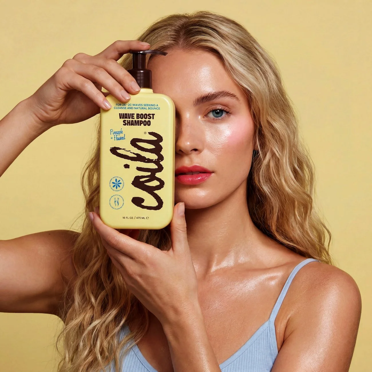
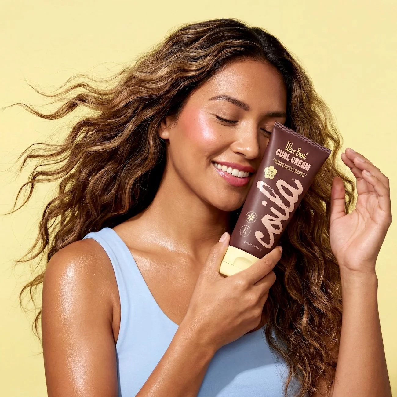
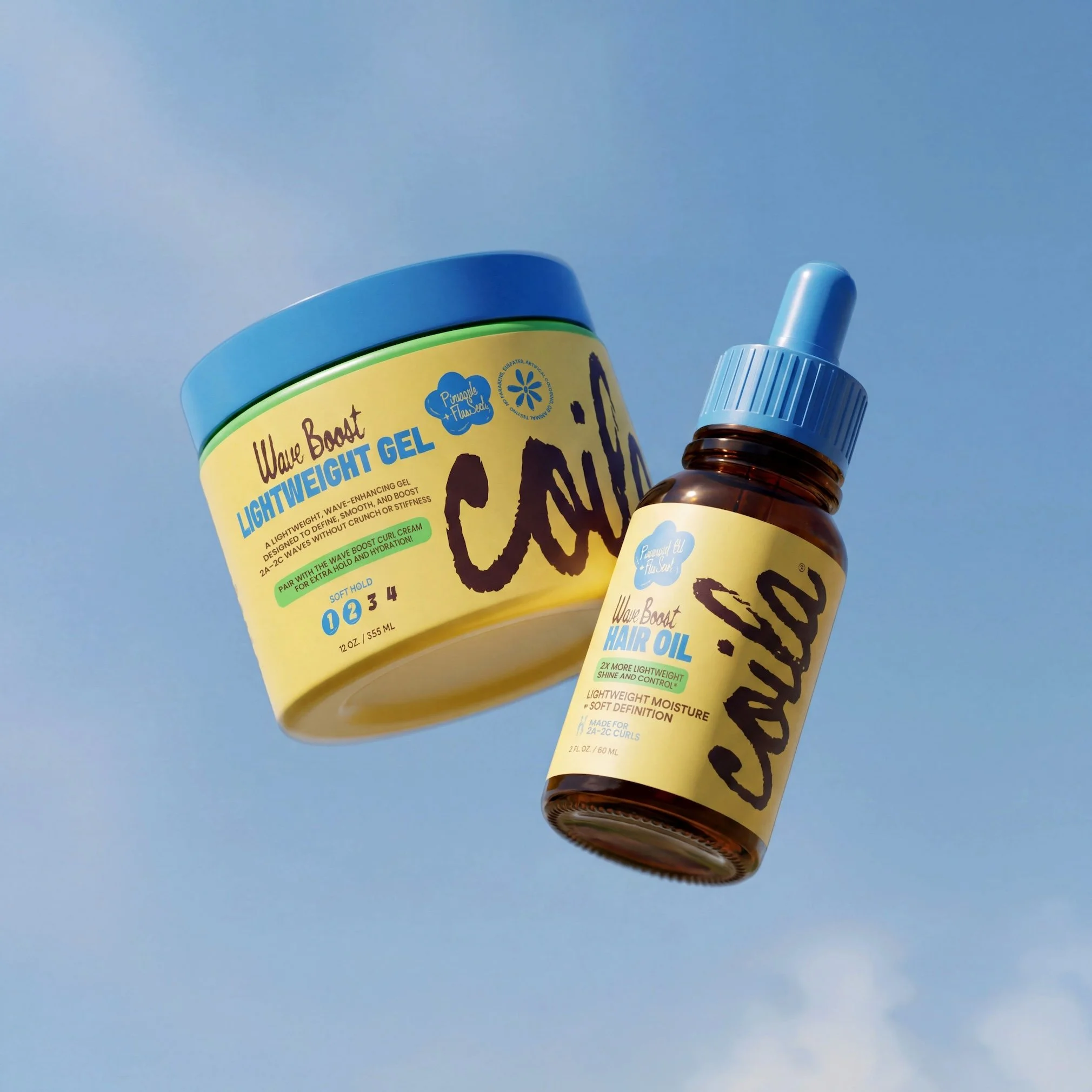
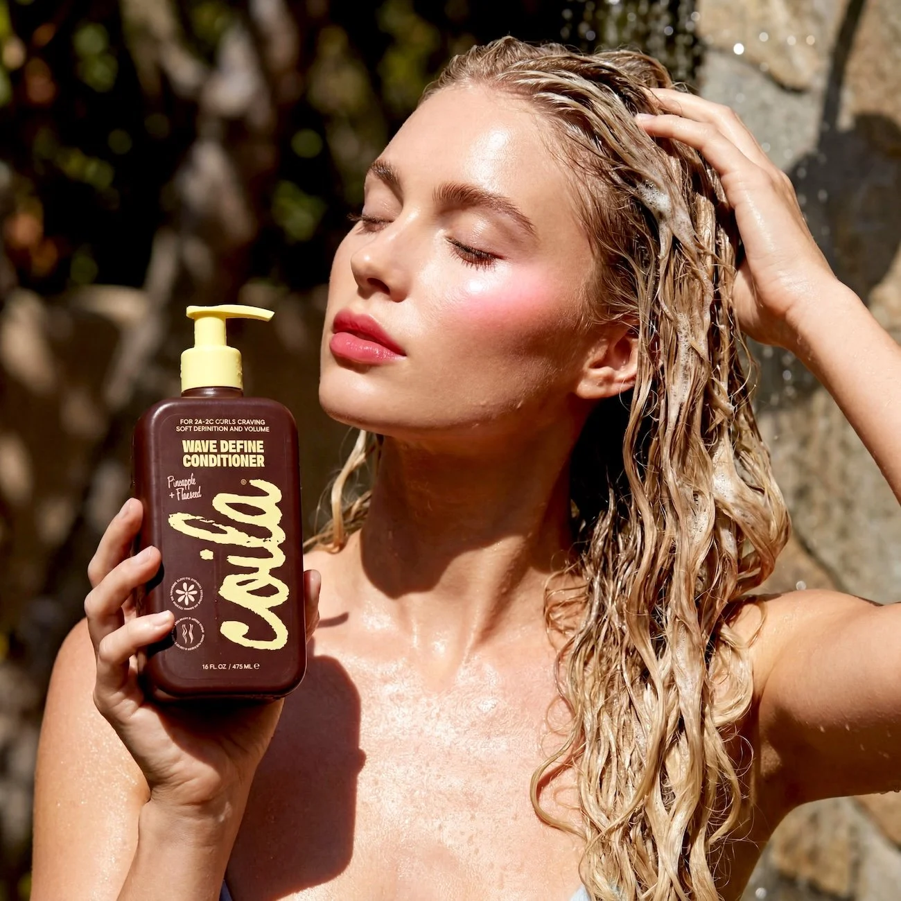
The Wave Boost + Define Line
The Wave Boost + Define Line is designed for wavy hair that sits between straight and curly—often lacking structure but easily weighed down. This system focuses on a gentle, lightweight cleanse paired with soft definition, helping enhance the natural wave pattern without stiffness or buildup. It brings balance to the hair by adding subtle volume at the root while supporting smooth, touchable movement through the lengths. The purpose of this collection is to give waves just enough structure and lift to feel intentional, while still maintaining an effortless, undone finish.
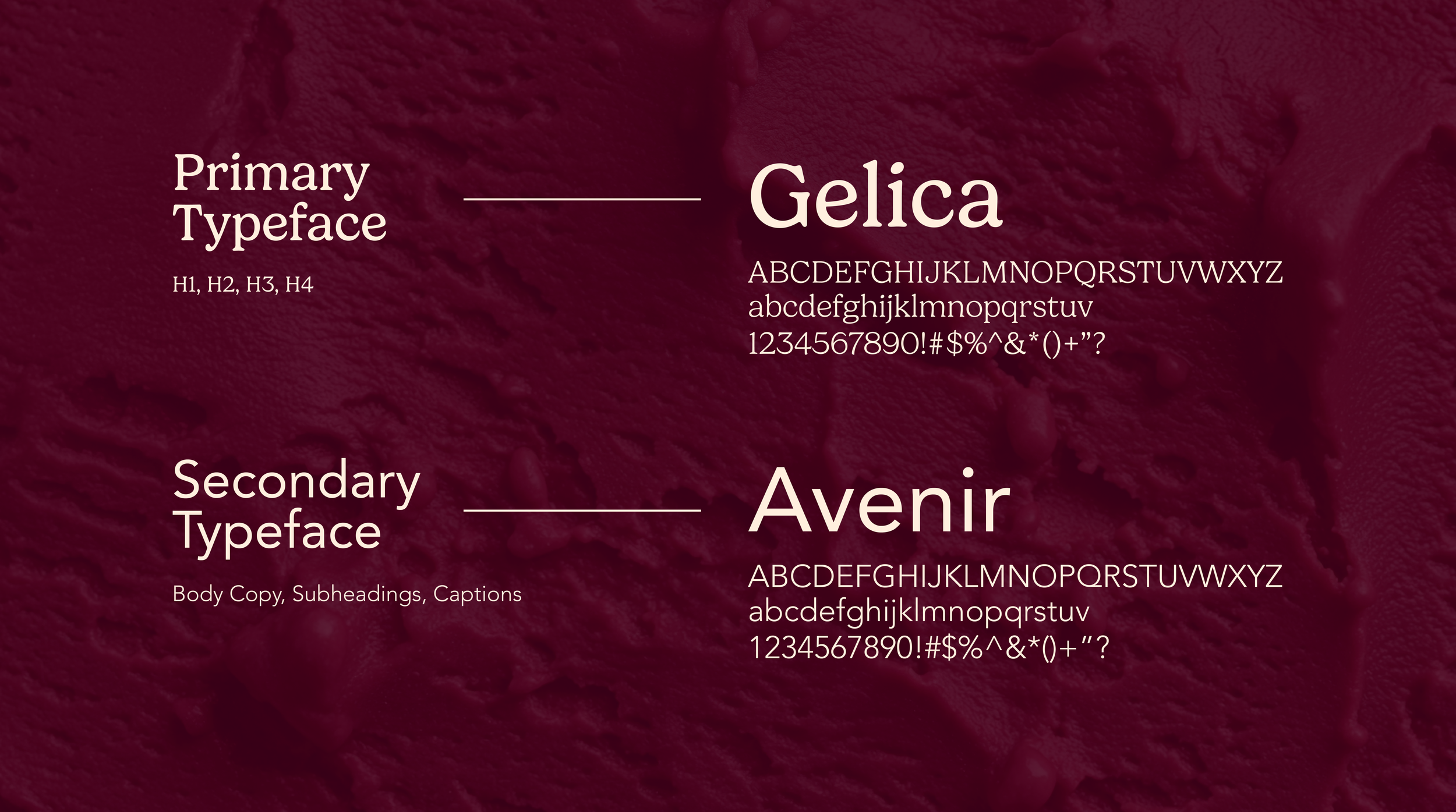
Typography
Gelica and Avenir work together to balance softness with structure. Gelica’s rounded forms, bracketed serifs, and gentle contrast bring warmth, elegance, and an artisanal feel, while Avenir’s clean geometry and open, balanced proportions introduce clarity and modern precision. Together, they create a typographic system that feels both indulgent and refined. It captures the elevated yet approachable experience of a upscale dessert lounge.
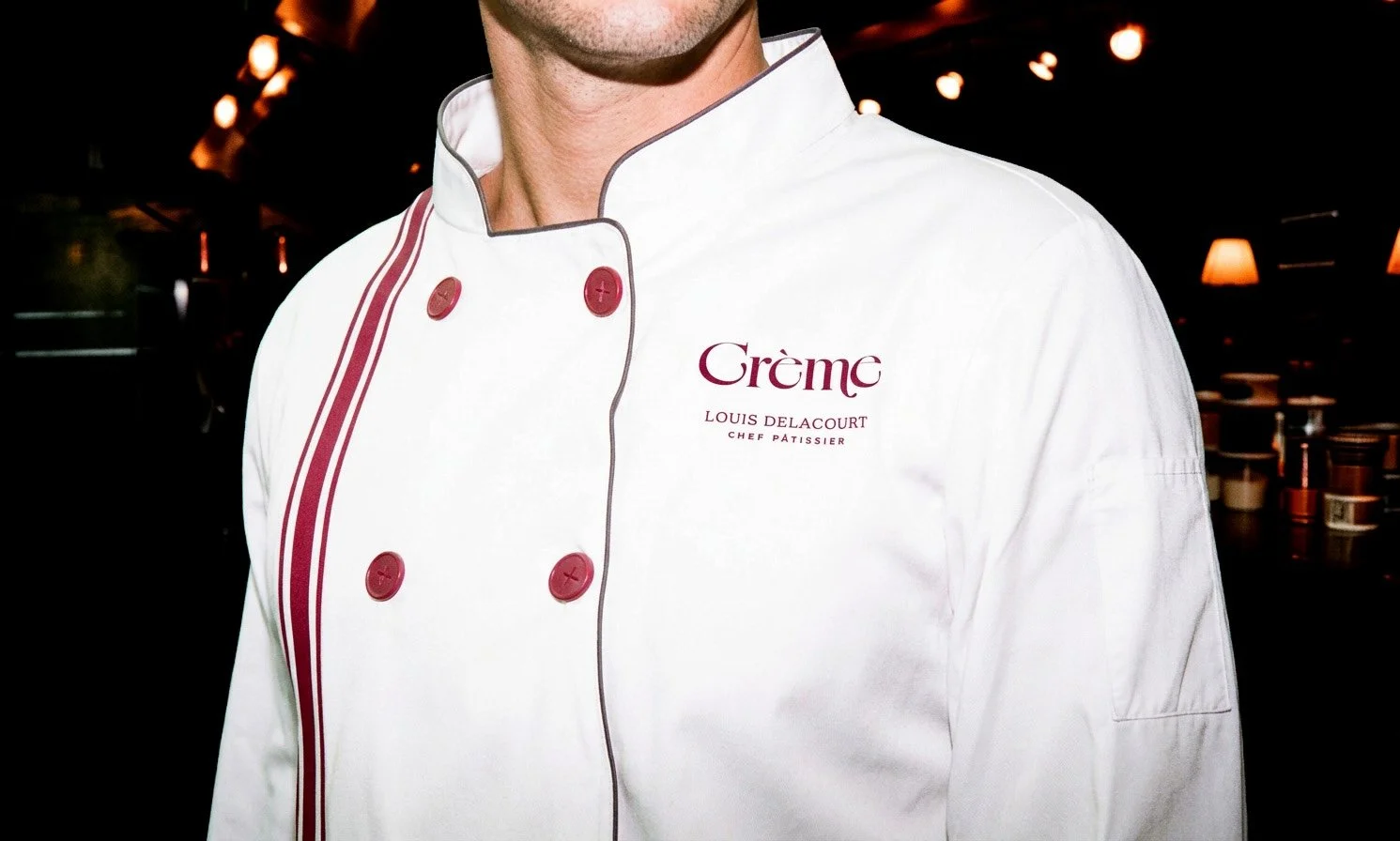
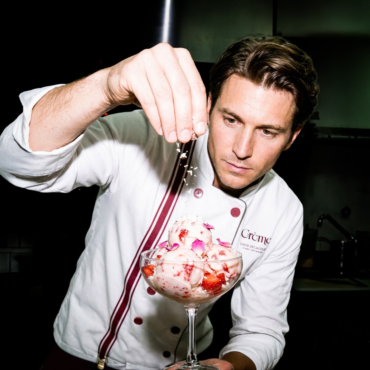
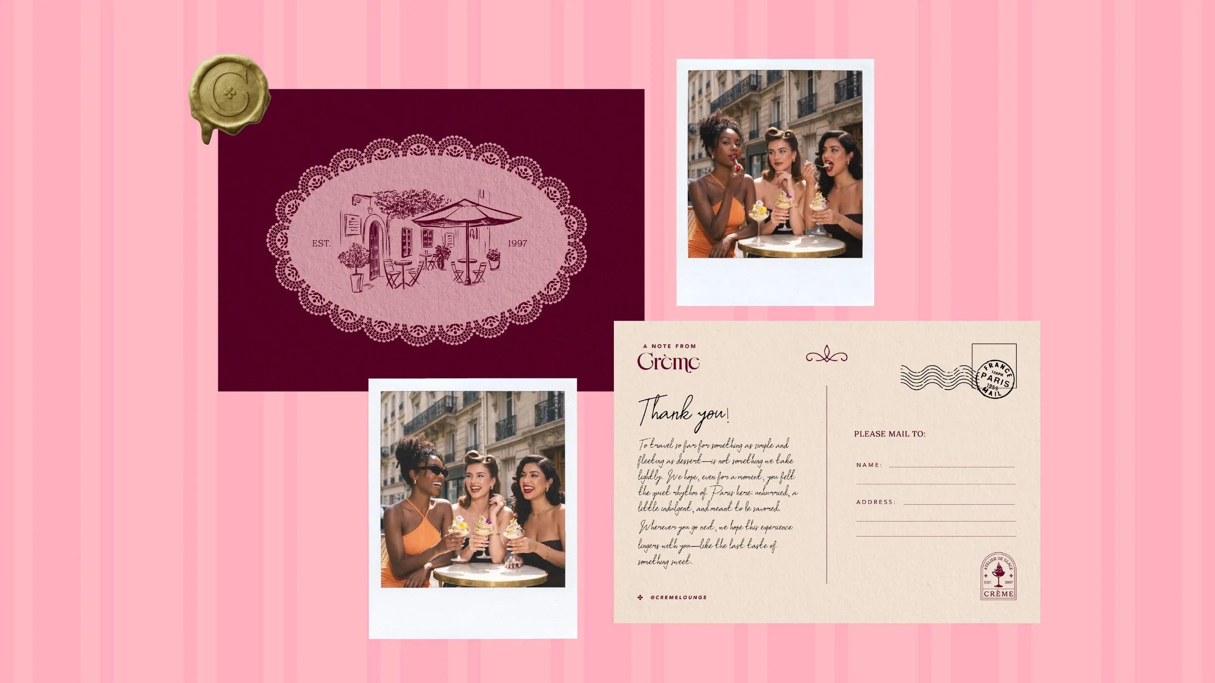
Postcard
The postcard was designed as a keepsake for guests visiting the Paris location. It is a small, tangible way to remember the experience and it extends the moment beyond the visit, allowing guests to take a piece of Crème with them. While guests are eating at the lounge, the staff captures the moment with a polaroid camera which allows for content for social media and advertising purposes.
Brand Tone and Voice
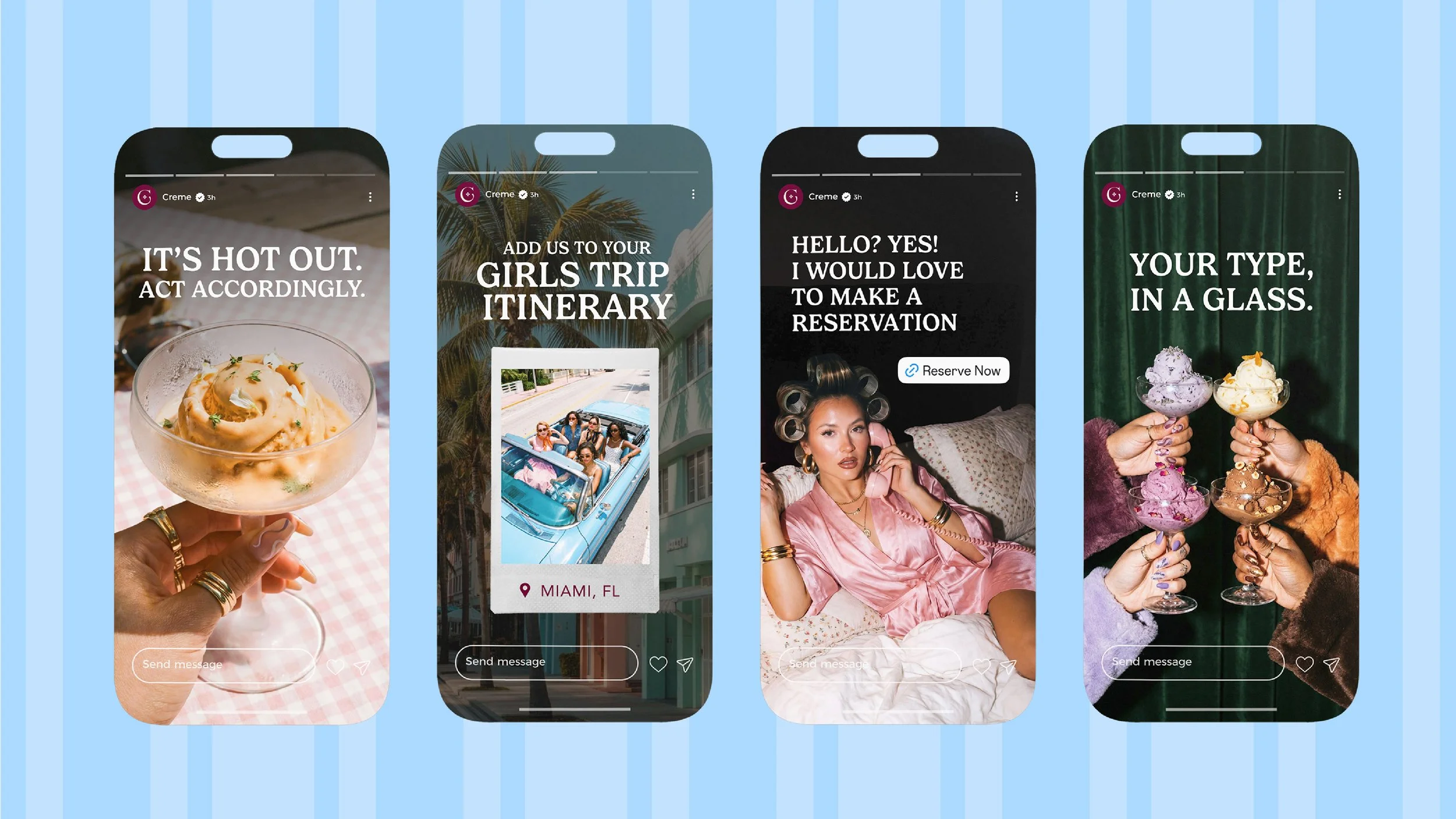
Crème speaks in a tone that avoids traditional luxury language in favor of dry, conversational phrasing that feels modern and culturally aware. Rather than over-explaining, the brand relies on short, confident statements that mirror how people naturally speak—creating a tone that feels both intimate and editorial. There is a subtle sense of humor throughout, often expressed through understatement and irony, allowing the brand to feel approachable without losing its elevated positioning. The brand uses hints of flirtatious humor to graviate the target audience of mainly woman ages 25-40.